27 Building an Epidemic Movie
This first tutorial is the baseline and the reference implementation for the whole module. We build one epidemic on one simple network, walk the entire pipeline from an empty network to an animated movie, and learn how to read what the movie shows. Every later tutorial is a one-line change to the network specification built here.
Picture the 100 nodes as the members of a small community: a residence hall, a workplace, a village. The edges are not “everyone who shares the air with everyone,” but the recurring close contacts, the specific pairs who spend enough time together for a close-contact infection to pass between them. Most people have only a handful of such contacts at a time, which is exactly the kind of sparse, selective structure a network model is built to represent. We keep the epidemic itself as simple as possible so that everything we see can be traced to the network.
Download the R script to follow along with this tutorial here.
27.1 Setup
We load EpiModel and ndtv. ndtv is part of the statnet suite; it animates any networkDynamic object, and because EpiModel simulates on exactly that object type, a simulation can be handed to ndtv directly. htmlwidgets lets us embed the movies in this page (you do not need it to follow along; we use it only to build the page).
We set a random seed before each model in this module, rather than once at the top, so that each model is reproducible on its own and re-running or inserting one cannot silently change the others. Skip these lines to get different draws.
27.2 The Network and Epidemic Model
We start with an edges-only model: the only thing we specify about who forms ties is how many ties there are. We ask for 40 edges among 100 nodes and a mean partnership duration of 20 time steps.
The 40 we passed as target.stats is an expected value: it is the average edge count the fitted model produces, taken over many draws of the network. Any single realized network scatters around it. When we simulate below, the number of edges present at a given moment will wander, typically in a band a few edges wide, not sit exactly on 40. The same is true of every target statistic in this module. It matters here because we are looking at single networks, where that scatter is fully on display, rather than at averages, where it washes out.
A target of 40 edges among 100 nodes is a mean degree of 2 * 40 / 100 = 0.8: on average a person has just under one ongoing close contact at a time.
27.2.1 Checking the fit
Before simulating an epidemic, we confirm the network model actually hit what we asked for. This is the netdx step from Module 4. It takes its own nsims and nsteps, independent of the epidemic below: the movie needs a small network over a short horizon to stay legible, but the diagnostic does not, and it costs about a second to run properly.
ncores on your machine
We pass ncores = 5 to run the diagnostic’s replicates in parallel. EpiModel caps this at the number of cores your machine actually has, so it is safe to leave as is; on a machine with fewer cores it simply uses what is available. Set ncores = 1 if you would rather force fully serial execution.
EpiModel Network Diagnostics
=======================
Diagnostic Method: Dynamic
Simulations: 5
Time Steps per Sim: 500

Formation Diagnostics
-----------------------
      Target Sim Mean Pct Diff Sim SE Z Score SD(Sim Means) SD(Statistic)
edges     40   40.106    0.265   0.68   0.156         2.106         6.089

Duration Diagnostics
-----------------------
      Target Sim Mean Pct Diff Sim SE Z Score SD(Sim Means) SD(Statistic)
edges     20   20.656    3.279  0.456   1.439         0.757         3.465

Dissolution Diagnostics
-----------------------
      Target Sim Mean Pct Diff Sim SE Z Score SD(Sim Means) SD(Statistic)
edges   0.05    0.049   -2.794  0.001  -2.048         0.001         0.034
The formation statistic recovers its target of 40 on average, and the mean duration recovers the 20 steps we asked for. Now anything we see in the movie can be attributed to the network we specified, rather than to a model that missed.
27.2.2 Running the epidemic
For the epidemic we use the “poker chip” setup: an SI process with a per-act transmission probability of 100%. That is not realistic for most diseases, but the point is to make spread fast and legible: with certain transmission, every contact between a susceptible and an infected person passes the infection, so the movie shows the network’s limits on spread rather than the disease’s. We run a single simulation over 25 steps, seeding 10 infections.
27.3 Building the Movie
Every movie in this module is built the same way, out of the netsim object, in four steps. We spell all four out here, once. In the later tutorials we fold them into a one-line helper so the network specification stays in the foreground.
Two ideas make it work:
- A
networkDynamicobject is the network EpiModel simulates on, with timing attached: it records when each edge is active and how each node’s attributes change over the run. That is what lets us replay the epidemic step by step. - A temporally extended attribute (TEA) is a nodal attribute whose value changes over time. Disease status is the key example: a node is susceptible for part of the run and infected afterward, and a TEA stores that whole history rather than a single value.
27.3.1 Step 1: Extract the dynamic network
get_network() pulls the networkDynamic object out of the netsim object. Printing it shows the observed time range, the number of distinct time points at which the network changed (distinct change times), and the total number of edges that were ever active (total edges).
NetworkDynamic properties:
  distinct change times: 27
  maximal time range: 0 until  Inf

 Dynamic (TEA) attributes:
  Vertex TEAs:    testatus.active

Includes optional net.obs.period attribute:
 Network observation period info:
  Number of observation spells: 2
  Maximal time range observed: 0 until 26
  Temporal mode: discrete
  Time unit: step
  Suggested time increment: 1

 Network attributes:
  vertices = 100
  directed = FALSE
  hyper = FALSE
  loops = FALSE
  multiple = FALSE
  bipartite = FALSE
  net.obs.period: (not shown)
  vertex.pid = tergm_pid
  total edges= 81
    missing edges= 0
    non-missing edges= 81

 Vertex attribute names:
    active status tergm_pid testatus.active vertex.names

 Edge attribute names:
    active
27.3.2 Step 2: Color nodes by status
color_tea() attaches a TEA that reads each node’s disease status at every step and stores a color for it. The attribute it creates is named ndtvcol, which is why every render call passes vertex.col = "ndtvcol".
27.3.3 Step 3: Compute the layout
The animation is controlled by three lists of settings. Only slice.par feeds compute.animation() here in Step 3: it chooses which time steps to show and how to bin dynamic edges into each frame. The other two are not used until render time in Step 4: render.par controls playback, and plot.par sets the plot margins.
Code
slice.par <- list(start = 1,          # first time step to show
                  end = 25,           # last time step to show
                  interval = 1,       # advance one time step per slice
                  aggregate.dur = 1,  # width of the time window collapsed into each slice
                  rule = "any")       # include an edge if it is active anywhere in that window

render.par <- list(tween.frames = 10, # interpolated frames between slices, for smooth motion
                   show.time = FALSE)  # do not print the time-step label on each frame

plot.par <- list(mar = c(0, 0, 0, 0)) # zero margins, so the network fills the frame
compute.animation() then works out where to draw each node in every frame. By default it uses the Kamada-Kawai force-directed layout, which pulls connected nodes together and pushes unconnected nodes apart. The absolute coordinates carry no meaning, there are no axes to read; only the relative positions of nodes matter. The layouts are chained frame to frame, so nodes do not jump around as the movie plays.
27.3.4 Step 4: Render
render.d3movie() draws the frames. It can return its output two ways. Passing a filename writes a standalone HTML file (using d3 JavaScript) that you can open in a browser; that is what the downloadable script does. Setting output.mode = "htmlWidget" instead embeds the movie directly in a page like this one. The two calls are otherwise identical.
Code
# What the downloadable script does: write a standalone HTML movie file.
render.d3movie(
  nw,
  render.par = render.par, plot.par = plot.par,
  vertex.cex = 0.9, vertex.col = "ndtvcol",
  edge.col = "darkgrey", vertex.border = "lightgrey",
  displaylabels = FALSE,
filename = file.path(getwd(), "movie-1-baseline.html"))27.4 How to Read the Movie
A few habits make these movies informative rather than just pretty:
- Color is disease status. Nodes change color when they become infected; watch where and when the color spreads.
- Position is relative, not absolute. A node’s location means nothing on its own; only which nodes are drawn near which others matters, and even that is a layout convenience, not a coordinate.
- Edges appear and disappear. An edge is drawn only while it is active. Ties forming and dissolving is the network changing under the epidemic, which is the whole reason for animating it.
- One run is one draw. Remember the caveat from the introduction: this is a demonstration of the mechanism, not a measurement. We seeded 10 infections, so several small outbreaks run at once; some seeds catch and some fizzle, purely by chance and by where each one landed.
27.5 Optional: Transmission Trees
Before moving on, it is worth seeing the static views of who infected whom, which EpiModel builds from the same simulation. These are an aside, not part of the core path, so skip ahead to the next tutorial if you only want the movies.
The transmission matrix records each infection event: who was infected, by whom, and when.
# A tibble: 6 × 8
# Groups:   at, sus [6]
     at   sus   inf network infDur transProb actRate finalProb
  <int> <int> <int>   <int>  <dbl>     <dbl>   <dbl>     <dbl>
1     2     9    74       1     14         1       1         1
2     2    13    61       1      7         1       1         1
3     2    36    65       1     15         1       1         1
4     2    44    93       1      3         1       1         1
5     2    59    98       1      9         1       1         1
6     2    68    74       1     14         1       1         1
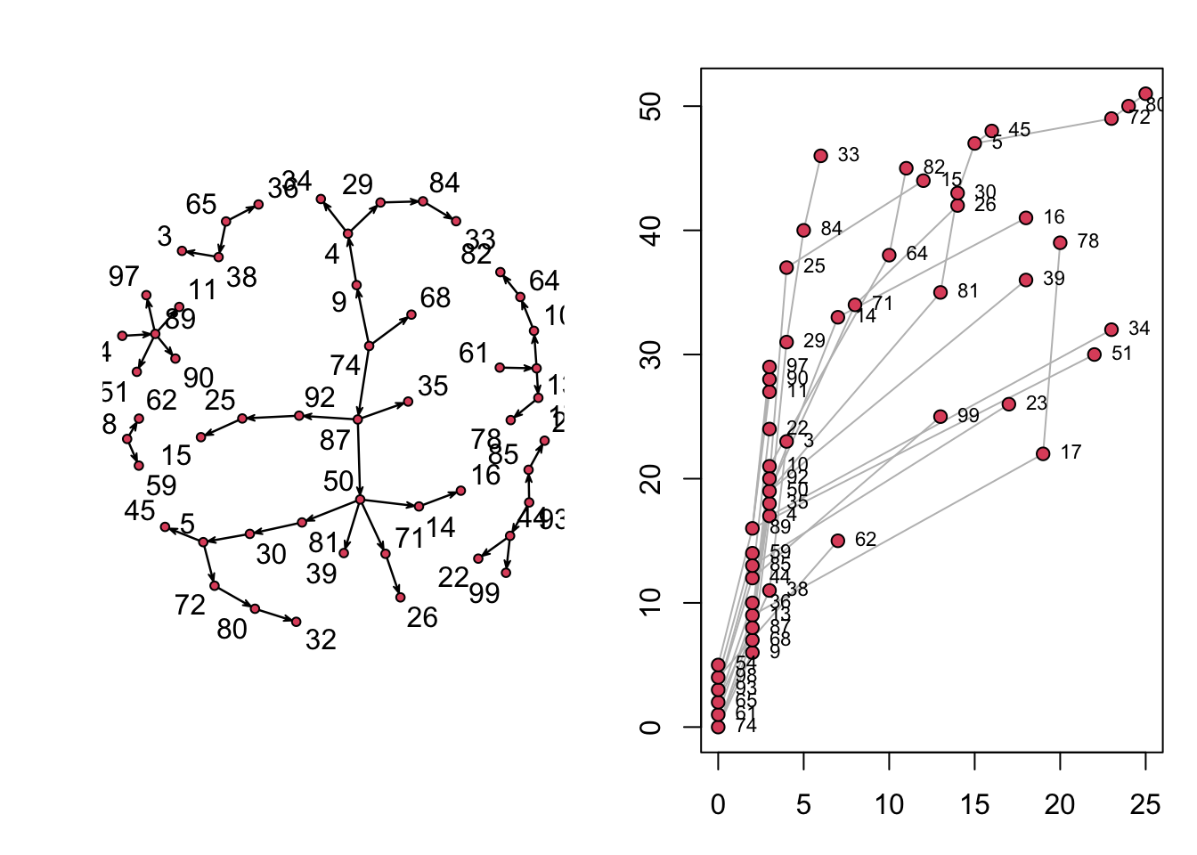
There are three built-in plots of this object. The first is a directed network of who infected whom. Because we seeded 10 infections rather than one, it is not a single connected component: each seed founds its own chain, and the chains never meet.
The second is a transmission timeline. Its horizontal axis is model (calendar) time, the 25 steps of the simulation. Its vertical axis is not time of any kind, and despite the “generation” label ndtv prints on it, it is not a transmission generation either: the plotted value is just a stacking counter that gives each infected node its own height, assigned in the order ndtv walks the trees (0 up to roughly the number infected, about 51 here), so that no two points overlap. Nodes in the same transmission generation do not share a height (the six seeds that transmit sit at heights 0 through 5, not all at 0), and the height carries no epidemiologic meaning. Read only the horizontal position (when each node was infected) and the connecting lines (who infected whom); ignore the vertical value.
Code
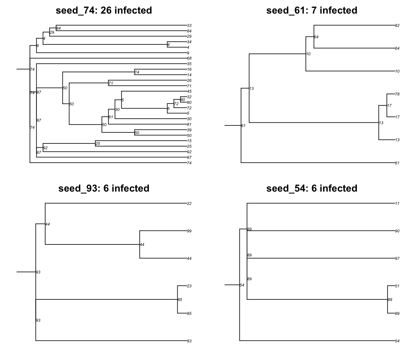
The third view is a phylogram. Plotting the transmat directly would draw every tree at once, so we convert it with as.phylo.transmat (exactly as in Module 4) and index into the result. As in that module, this is the model’s exact, known transmission tree, not an estimated molecular phylogeny.
found multiple trees, returning a list of 6phylo objectsseed_74 seed_61 seed_65 seed_93 seed_98 seed_54
26 7 4 6 3 6 Two things are worth reading off that vector. First, there are fewer trees than the 10 seeds: a seed that never transmits leaves no tree, so the missing ones are outbreaks that died immediately. Second, the trees that do exist vary enormously in size, even though every seed had the same transmission probability on the same network. All that differed was where each one landed and how well connected that neighborhood happened to be. That spread, from identical starting conditions, is the same fact behind the module’s caveat: a single simulation can demonstrate a mechanism but cannot measure an effect.
In each tree below, only the tips are the distinct infected individuals, and their count is the “N infected” in the panel title. The numbers printed at the internal branch points repeat the infector at each transmission event, so someone who infected several people appears once per transmission plus once as their own tip. That is why you see more numbers than the title’s count; do not read the repeats as extra people.
Code
With the baseline and the pipeline in hand, the next tutorial starts changing the network and watching what happens.