37 Epidemic Models with Demography
This tutorial demonstrates how to model a Susceptible-Infected (SI) epidemic in an open population. An example of an SI epidemic is HIV, with infected persons never leaving the infected stage before mortality. Modeling HIV is quite complicated, and this tutorial is not meant to be a full-scale HIV model: it does not include many components of HIV models, such as disease stage, drug therapy, and so on. This only represents SI dynamics generally with the possibility of vital dynamics. Although we use HIV as the running example, the vital-dynamics machinery shown here (arrivals, departures, and the coefficient adjustments that accompany them) is general to any open-population disease: it applies equally to, say, an endemic infection followed over many years, or a childhood infection in a population with ongoing births and deaths (an immunizing childhood infection would use an SIR rather than SI compartmental structure, but the vital-dynamics machinery is the same).
The population is open because we are now including arrivals and departures in the epidemic process. Simulating an epidemic in an open population requires adjustments that accommodate changes to the network structure over time, as detailed in the Module slides.
The central new idea in this module is that an open population gives a partnership a second way to end, and that we have to adjust the network model to keep it on target once that second way exists. We build up in that order. We start with the cleanest possible case, a bare edges-only network, and isolate the adjustment (the “death correction”) that protects relational duration. We then let the population size itself change, which brings in a second adjustment (the network-size correction). Only once both corrections are clear on the simple network do we add heterogeneous groups, where the two corrections have to work together and one of them turns subtle. The next tutorial adds the final complication, feedback from disease status back onto the network.
A time step is a week throughout this module. Every duration and rate below is on that scale: partnerships last 40 weeks on average, a departure rate of 0.005 per week implies an average time in the population of 1 / 0.005 = 200 weeks, and the arrival and departure rates in param.net are all per week.
Download the R script to follow along with this tutorial here.
Start with loading EpiModel:
In a closed population a partnership can end in only one way: the two people break up. That is all the dissolution model describes, and its single dial is the mean relational duration. At a duration of 40 weeks, an edge dissolves with probability 1/40 = 0.025 each week. (This is the persistence chain from Module 5: persistence p = 1 - 1/duration, and the coefficient is logit(p).)
Open the population and a partnership gains a second way to end: one of the two partners leaves the population, most often by dying. It is the same distinction as the two ways a marriage can end, by divorce or by the death of a spouse. These are competing risks, two clocks running at once, and whichever rings first ends the edge. Because either partner leaving is enough, the departure clock adds a hazard of about 2 * d.rate per week.
Here is the problem. We estimated the dissolution model from cross-sectional data that knew nothing about departure, so if we simply layer departures on top, the two hazards stack. At a duration of 40 and a departure rate of 0.005, the realized ending hazard rises from 0.025 to about 0.025 + 0.010 = 0.035 per week, and the mean duration we actually observe falls well below 40 weeks. Partnerships end sooner than we asked, not because we mis-specified breakup, but because we left out the second clock.
The death correction lowers the breakup hazard just enough that the two clocks together sum back to 0.025, restoring the realized duration to 40. Protecting duration against an added way to end requires making edges more persistent, which is why the correction raises the coefficient rather than lowering it.
37.1 The death correction on a minimal network
The correction is defined to hold one quantity on target: the mean relational duration. Everything else (mean degree, edge count) is downstream of duration. The clearest way to see the correction work is therefore to strip the model to a bare edges-only network, where nothing else is going on, and plot duration directly, with and without the correction.
The death correction is the upward adjustment dissolution_coefs makes to the dissolution (persistence) coefficient so that realized relational duration stays on target once departures are added. d.rate is the per-week departure rate it corrects for. The name is a course convention; the EpiModel documentation describes it as adjusting for the “competing risk of departure,” and departure is most often, but not only, death. The correction changes only the coefficient the simulation uses. It does not change the TERGM estimation or the netdx diagnostics, which both run on the crude (uncorrected) coefficient.
dissolution_coefs takes the departure rate through its d.rate argument. A d.rate of 0.005 corresponds to an average time in the population of 1 / 0.005 = 200 weeks. That is deliberately short: we exaggerate the departure rate here so the effect of the correction is large and quick to see, and use a realistic, much smaller value later. If you push d.rate too high relative to the duration, the competing risk of departure makes the target unachievable and dissolution_coefs stops with an informative error:
tergmLite: the tradeoff behind this demonstration
Duration statistics are retained only when the full network history is kept, which means running with tergmLite = FALSE. tergmLite = TRUE keeps only a sparse snapshot of the current network, which is what makes production runs fast, but it throws away the edge-age history the duration diagnostic is computed from. That is the whole reason this section runs a small tergmLite = FALSE model, so we can read realized durations directly. When you build your own open-population models, keep tergmLite = TRUE for the long runs and switch it off only for the short diagnostic runs where you need the network history.
ncores on your machine
As in the earlier modules, we pass ncores = 5 to run the replicates in parallel. EpiModel caps this at the number of cores your machine actually has, so it is safe to leave as is; on a machine with fewer cores it simply uses what is available. Check your core count with parallel::detectCores(), or set ncores = 1, if you want to control it explicitly.
37.1.1 A minimal demonstration
We fit the same edges-only network two ways: once with the death correction (d.rate = 0.005) and once without it (d.rate = 0). The target is a mean degree of 0.5, so 125 edges on 500 nodes. Note the corrected coefficient is the larger of the two.
Code
nw.demo   <- network_initialize(n = 500)
form.demo <- ~edges
ts.demo   <- 125   # mean degree 0.5 on 500 nodes: 0.5 * 500 / 2

coef.corr <- dissolution_coefs(~offset(edges), duration = 40, d.rate = 0.005)
coef.none <- dissolution_coefs(~offset(edges), duration = 40, d.rate = 0)

est.corr <- netest(nw.demo, form.demo, ts.demo, coef.corr)
est.none <- netest(nw.demo, form.demo, ts.demo, coef.none)
Code
Dissolution Coefficients
=======================
Dissolution Model: ~offset(edges)
Target Statistics: 40
Crude Coefficient: 3.663562
Mortality/Exit Rate: 0.005
Adjusted Coefficient: 4.172722Dissolution Coefficients
=======================
Dissolution Model: ~offset(edges)
Target Statistics: 40
Crude Coefficient: 3.663562
Mortality/Exit Rate: 0
Adjusted Coefficient: 3.663562We simulate both with balanced vital dynamics, so arrivals and departures cancel in expectation and the population size stays near 500 rather than trending up or down. It still fluctuates from step to step and from run to run, because arrivals and departures are stochastic; what balance buys us is the absence of any systematic change in size. With no systematic size change, the network-size correction (the subject of the next section) has essentially nothing to act on, leaving the death correction as the only thing that meaningfully differs between the two runs.
Three new arguments to param.net name who enters and leaves the population each week: a.rate is the arrival (birth) rate, and ds.rate and di.rate are the departure (death) rates among susceptibles and infecteds. One new argument to control.net, resimulate.network = TRUE, redraws the network at every step so those arrivals and departures can actually add and remove nodes. We gloss them here and give each its fuller treatment where the heterogeneous model uses them below.
Code
param.demo   <- param.net(inf.prob = 0.1, act.rate = 1,
                          a.rate = 0.005, ds.rate = 0.005, di.rate = 0.005)
init.demo    <- init.net(i.num = 50)
control.demo <- control.net(type = "SI", nsteps = 250, nsims = 5, ncores = 5,
                            resimulate.network = TRUE, tergmLite = FALSE,
                            nwstats.formula = ~edges + meandeg)

sim.corr <- netsim(est.corr, param.demo, init.demo, control.demo)
sim.none <- netsim(est.none, param.demo, init.demo, control.demo)
Now we plot the mean age of the partnerships active at each step, which is the realized-duration diagnostic. On the left, with the correction, it holds near the target of 40; without it, partnerships end sooner than we asked and the realized duration settles well below 40, because departures are breaking edges the dissolution model alone did not expect to lose. On the right, mean degree comes along for the ride: shorter partnerships mean fewer are ongoing at any moment, so the uncorrected mean degree sags below 0.5 while the corrected run holds near it. We never targeted mean degree here; it followed from duration.
Code
# Mean age of active partnerships lives in the diss.stats slot, populated only
# when tergmLite = FALSE. It is a cross-sectional age, so it is not biased by
# the right-censoring that would distort a mean of completed partnership lengths.
mean_age <- function(sim) {
  a <- sapply(seq_len(sim$control$nsims),
              function(s) sim$diss.stats[[s]][[1]]$meanageimputed)
  rowMeans(a, na.rm = TRUE)
}
mean_degree <- function(sim) {
  ns <- get_nwstats(sim, network = 1)
  as.numeric(tapply(ns$meandeg, ns$time, mean))
}

par(mfrow = c(1, 2))

plot(mean_age(sim.corr), type = "l", lwd = 2.5, col = "seagreen",
     ylim = c(20, 45), xlab = "Time step (weeks)",
     ylab = "Mean age of active partnerships", main = "Relational duration")
lines(mean_age(sim.none), lwd = 2.5, col = "firebrick")
abline(h = 40, lty = 2, lwd = 2)
legend("bottomright", bty = "n", lwd = c(2.5, 2.5, 2), lty = c(1, 1, 2),
       col = c("seagreen", "firebrick", "black"),
       legend = c("With correction", "Without correction", "Target = 40"))

plot(mean_degree(sim.corr), type = "l", lwd = 2.5, col = "seagreen",
     ylim = c(0.3, 0.6), xlab = "Time step (weeks)", ylab = "Mean degree",
     main = "Mean degree (along for the ride)")
lines(mean_degree(sim.none), lwd = 2.5, col = "firebrick")
abline(h = 0.5, lty = 2, lwd = 2)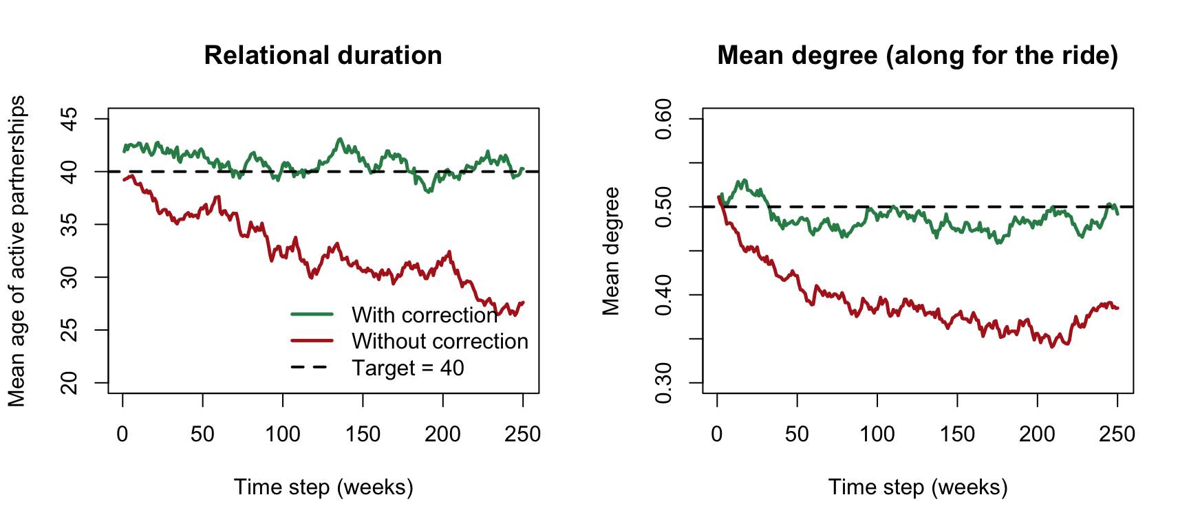
The diagnostic above reads duration off the ages of partnerships that are active on a given day. That works because of a fact worth building intuition for: for the geometric (memoryless) dissolution model EpiModel uses, the mean age of an ongoing partnership equals its mean total duration, so the left panel can be read directly against the target of 40 rather than against half of it.
We built a small browser app that turns this demonstration into something you can manipulate. Drag the departure rate and watch the realized duration fall away from its target without the correction and hold with it; see the breakup and departure hazards stack and the correction pull the total back to 1 / duration; and run a live simulation of both the mean age of active partnerships and the cross-sectional edge count, watching the edge count fall right along with the shortened duration.
Open the death-correction app in a new tab
The app runs entirely in your browser; the first load compiles R to WebAssembly and can take 20 to 40 seconds, and it needs a network connection at that moment.
37.2 Changing population size
So far arrivals and departures balanced, so the population size held near 500. Now let the disease itself change the size: we make infected people depart faster than susceptibles (disease-induced mortality), with arrivals too few to keep pace, so the population shrinks as the epidemic grows. This introduces the module’s second adjustment, one that netsim applies for us automatically.
An open population forces two separate adjustments to the network model. They are easy to confuse, because both act on the edges coefficient and both can be read off the mean-degree plot, but they answer different questions.
The death correction is about how edges end. In an open population an edge can end two ways: it can dissolve on its own, or a partner can depart (die). These are competing risks. To hold relational durations on target despite this extra way edges break, the model raises the edge-persistence coefficient. You set it yourself, through
d.rateindissolution_coefs, and it is needed whenever there are departures, even when the population size has no systematic trend (as in the balanced run above).The network-size correction is about how many edges there should be when
Nchanges. As the population shrinks or grows, the raw edge count should follow it, but the mean degree (each node’s average number of partners, \(2E/N\)) should not.netsimapplies this correction automatically, shifting theedgescoefficient by alog(N)offset at each step, and it is needed only whenNactually changes.
A compact way to keep them apart: the death correction holds duration fixed and lets the mean degree come along with it; the network-size correction holds mean degree fixed and lets the edge count fall. The balanced run above isolated the first, because N was constant there. The run below exercises both at once.
We reuse the corrected edges-only network from the demonstration above (est.corr, which carries the death correction for d.rate = 0.005). All that changes is the vital dynamics: infecteds now depart at di.rate = 0.009 against ds.rate = 0.003 for susceptibles, and arrivals (a.rate = 0.002) do not replace them, so the population shrinks. We can switch back to tergmLite = TRUE here, because the quantities we want (population size, edge count, mean degree) do not need the edge-age history.
Code
param.shrink   <- param.net(inf.prob = 0.1, act.rate = 1,
                            a.rate = 0.002, ds.rate = 0.003, di.rate = 0.009)
control.shrink <- control.net(type = "SI", nsteps = 250, nsims = 10, ncores = 5,
                              resimulate.network = TRUE, tergmLite = TRUE,
                              nwstats.formula = ~edges + meandeg)

sim.shrink <- netsim(est.corr, param.shrink, init.demo, control.shrink)
Now plot the population size, the edge count, and the mean degree side by side. The population falls by roughly half over the run, and the raw edge count falls right along with it, because fewer people means fewer partnerships. The mean degree, though, holds flat near its target: that is the network-size correction at work, shifting the edges coefficient by a log(N) offset each step so that the mean degree stays fixed while the raw count is free to follow N. This preserves the same quantity, mean degree, that Module 6 held invariant when scaling network size, though here the correction is applied automatically at each simulation step rather than at estimation time.
Code
par(mfrow = c(1, 3))
plot(sim.shrink, y = "num", main = "Population size",
     sim.lines = TRUE, legend = FALSE)
plot(sim.shrink, type = "formation", stats = "edges", main = "Edge count",
     qnts = FALSE, sim.lines = TRUE)
plot(sim.shrink, type = "formation", stats = "meandeg", main = "Mean degree",
     qnts = FALSE, sim.lines = TRUE)
abline(h = 0.5, lty = 2, lwd = 2)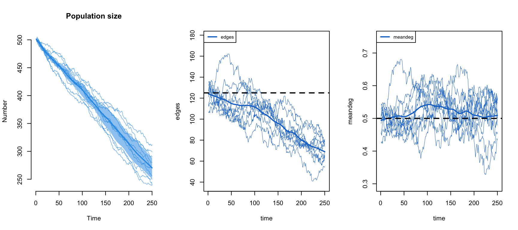
Notice one thing that will matter in a moment. Here a single d.rate in dissolution_coefs held the death correction on target even though susceptibles and infecteds depart at different rates. It worked because this network is edges-only: every node has the same expected degree regardless of status, so an infected departure breaks the same expected number of edges as a susceptible one, and the single average rate is a good stand-in. Once degree correlates with disease status, that stops being true, which is exactly the complication the next section runs into.
37.3 Heterogeneous groups
We now add the structure the module has been building toward: two groups with different activity, assortative mixing between them, and disease-specific mortality on top. This is where the two corrections have to work together, and where the single d.rate stops being straightforward.
Unlike in the Nodal Attributes tutorial, we use an ordinary attribute here rather than the special group attribute. So we allow for heterogeneity in network structure but assume homogeneous epidemic parameters. It is straightforward to extend EpiModel (we cover this in NME-II) to let any arbitrarily specified attribute affect both the network structure and the epidemic processes.
37.3.1 Network structure
The network is initialized as before, but now we set a vertex attribute of risk group. Risk group is a binary variable, with the two groups evenly sized.
37.3.2 Network parameterization
We add heterogeneity in mean degree by risk group, and homophily in risk group mixing, using nodefactor and nodematch terms. The nodefactor term represents variation in the overall mean degree by the named attribute, risk; the nodematch term represents mixing by that attribute.
The overall mean degree will be 0.5, but will vary by risk group: risk group 1 will have a mean degree of 0.75, which (since the overall mean is 0.5 and the groups are equal in size) forces risk group 0 to 0.25.
The target statistic for the edges term is the overall mean degree times the population size, divided by two because each edge involves two nodes: 0.5 * 500 / 2 = 125. The target for the nodefactor term is the mean degree of risk group 1 times the size of risk group 1: 0.75 * 250 = 187.5. Finally, we specify that 90% of partnerships occur between persons of the same risk group: 0.9 * 125 = 112.5 edges.
The dissolution model is a homogeneous edges-only model with an average relational duration of 40 weeks, and it carries the death correction for a realistic departure rate. A d.rate of 0.001 corresponds to an average time in the population of 1 / 0.001 = 1000 weeks (about 19 years), much smaller than the exaggerated 0.005 we used to make the effect visible earlier.
Code
Dissolution Coefficients
=======================
Dissolution Model: ~offset(edges)
Target Statistics: 40
Crude Coefficient: 3.663562
Mortality/Exit Rate: 0.001
Adjusted Coefficient: 3.7469
The d.rate parameter is the average departure rate per week, and it must correspond to the departure rates specified below in param.net. When there is disease-induced mortality, mortality is no longer homogeneous, but d.rate is still a single rate: no one value is exactly correct, so we choose an aggregate value that keeps the network diagnostics on target and explore how to find it below.
37.3.3 Estimation and diagnostics
The network model is estimated with netest.
The summary function shows the coefficient estimates for the nodefactor and nodematch terms, which are strong (> 0 on the log-odds scale) and highly significant. Their specific values do not matter much here (what matters is how they generate simulations of the complete network, below), but the positive sign of both terms shows they are greater than expected under the null model, precisely as we parameterized them.
Call:
ergm(formula = formation, constraints = constraints, offset.coef = coef.form,
    target.stats = target.stats, eval.loglik = FALSE, control = set.control.ergm,
    verbose = verbose, basis = nw)

Monte Carlo Maximum Likelihood Results:

                  Estimate Std. Error MCMC % z value Pr(>|z|)
edges              -9.1329     0.3160      0 -28.900   <1e-04 ***
nodefactor.risk.1   0.6192     0.1097      0   5.642   <1e-04 ***
nodematch.risk      2.0098     0.3345      0   6.007   <1e-04 ***
---
Signif. codes:  0 '***' 0.001 '**' 0.01 '*' 0.05 '.' 0.1 ' ' 1
Log-likelihood was not estimated for this fit. To get deviances, AIC, and/or BIC, use ‘*fit* <-logLik(*fit*, add=TRUE)’ to add it to the object or rerun this function with eval.loglik=TRUE.
Dissolution Coefficients
=======================
Dissolution Model: ~offset(edges)
Target Statistics: 40
Crude Coefficient: 3.663562
Mortality/Exit Rate: 0.001
Adjusted Coefficient: 3.7469
For the diagnostics we expand nwstats.formula beyond the fitted terms to monitor mean degree and mixing by risk. Setting levels = NULL in the nodefactor term outputs statistics for both risk groups. We can also monitor nodematch with diff = TRUE, which allows for differential homophily by group. In this model there would never be a reason to fit differential homophily, because with a binary attribute the two within-group (diagonal) cells of the mixing matrix are already determined by the edges, nodefactor, and overall nodematch terms together; it adds information only for models without a nodefactor term, or for attributes with more than two levels. But we monitor it here for illustration.
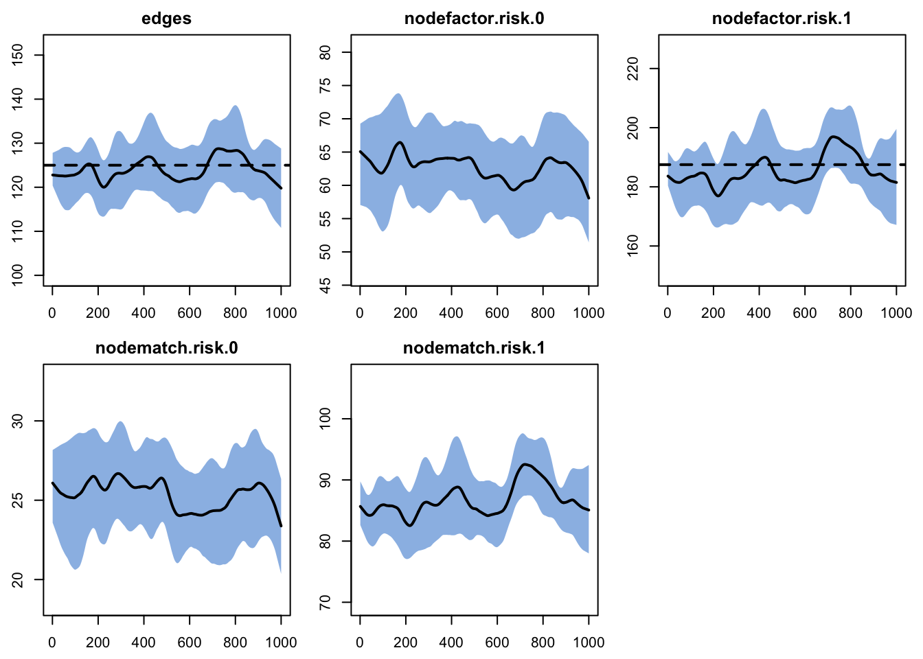
Printing the diagnostics shows a good fit between the targets and the simulated outputs.
EpiModel Network Diagnostics
=======================
Diagnostic Method: Dynamic
Simulations: 10
Time Steps per Sim: 1000

Formation Diagnostics
-----------------------
                  Target Sim Mean Pct Diff Sim SE Z Score SD(Sim Means)
edges              125.0  123.890   -0.888  0.909  -1.222         1.583
nodefactor.risk.0     NA   63.226       NA  0.818      NA         3.220
nodefactor.risk.1  187.5  184.554   -1.571  1.624  -1.814         4.432
nodematch.risk.0      NA   25.397       NA  0.392      NA         1.308
nodematch.risk.1      NA   86.061       NA  0.801      NA         2.397
                  SD(Statistic)
edges                    11.046
nodefactor.risk.0        10.540
nodefactor.risk.1        19.489
nodematch.risk.0          4.950
nodematch.risk.1          9.617

Duration Diagnostics
-----------------------
      Target Sim Mean Pct Diff Sim SE Z Score SD(Sim Means) SD(Statistic)
edges     40   39.996    -0.01  0.279  -0.014         0.852         3.499

Dissolution Diagnostics
-----------------------
      Target Sim Mean Pct Diff Sim SE Z Score SD(Sim Means) SD(Statistic)
edges  0.025    0.025    0.333      0   0.585             0         0.014
Plotting the diagnostics shows the simulations tracking the targets for the terms in the formation model. We skip plotting the dissolution model diagnostics for this example.
Recall that this TERGM estimation and diagnostics has not yet been confronted with the complexities of an open population in which there is arrival and departure. The population size and composition are fixed during this step, so we should not expect any challenges from the corrections yet. Those enter only in the epidemic simulation.
37.3.4 Epidemic simulation
This simulation investigates how variation in mean degree by risk group and highly assortative mixing jointly affect epidemic prevalence, overall and by group. The parameters entered into param.net should be familiar by now, with three additions for the open population. Because this is an SI epidemic there is no recovery rate. The three demographic parameters describe the same process that d.rate in dissolution_coefs anticipates: they govern who actually enters and leaves the population, while d.rate tells the network model how much extra edge persistence to build in to offset the partnerships those departures would otherwise break. The two must be kept consistent.
Code
- 1
- Per-act transmission probability, as in the earlier modules.
- 2
- Acts per partnership per week, raised to 5 here (from 1 in the edges-only demos above) to drive a substantial epidemic on the heterogeneous network.
- 3
-
a.rate, the arrival rate: the per-capita rate at which new (susceptible) nodes enter the population each week. AtN = 500this yields about500 * 0.001 = 0.5arrivals per week. This is the one demographic rate that does not appear indissolution_coefs, because a new node adds an open slot but does not end any existing partnership. - 4
-
ds.rate, the departure rate among susceptibles: the per-capita rate at which susceptible nodes leave the population (death or other exit). - 5
-
di.rate, the departure rate among infecteds. Here it equalsds.rate, so mortality does not depend on disease status and the population size stays stable. We raise it aboveds.ratefurther below to add disease-specific mortality.
As in the previous tutorials, we only need to specify the number infected at the outset. To reach stable epidemic conditions quickly, we set the initial prevalence to 10% (50 of the 500 nodes), distributed at random.
The control settings share some structure with the Basic EpiModel tutorials, with a few new arguments:
resimulate.network: whether the network is re-drawn at every step (TRUE) rather than simulated once as a fixed dynamic timeline (FALSE, the default). You need it whenever the network itself must change during the run: here because arrivals and departures add and remove nodes, and in the next tutorial because a formation term depends on an attribute (disease status) that changes over time.epi.by: a categorical attribute by which to break out the prevalence and flow outputs (here"risk"), so we can compare epidemic outcomes across groups. It is the general-attribute counterpart to the automatic by-group output that the specialgroupattribute provides.tergmLite: a streamlined, memory-light network representation that speeds simulation substantially, at the cost of not retaining the full network history, so you cannot reconstruct or plot the network at past time points. Good for the large or long runs typical of epidemic models.
For the main comparison we run 20 simulations with tergmLite = TRUE, adding a couple of network terms to monitor in the post-simulation diagnostics.
To simulate the epidemic model, we again use netsim.
37.3.5 Epidemic model analysis
Our analysis covers the post-simulation network diagnostics, then the epidemiological outcomes overall and by risk group.
37.3.5.1 Post-simulation diagnostics
It is important to examine the network diagnostics after the epidemic simulation, since the vital dynamics may have changed the network structure in unexpected ways.
Printing the netsim object shows its contents, now including post-simulation diagnostics similar to a netdx object.
EpiModel Simulation
=======================
Model class: netsim

Simulation Summary
-----------------------
Model type: SI
No. simulations: 20
No. time steps: 300
No. NW groups: 1

Fixed Parameters
---------------------------
inf.prob = 0.1
act.rate = 5
a.rate = 0.001
ds.rate = 0.001
di.rate = 0.001
groups = 1

Model Output
-----------------------
Variables: s.num s.num.risk0 s.num.risk1 i.num i.num.risk0
i.num.risk1 num num.risk0 num.risk1 si.flow ds.flow di.flow
a.flow
Networks: sim1 ... sim20
Transmissions: sim1 ... sim20

Formation Statistics
-----------------------
                  Target Sim Mean Pct Diff Sim SE Z Score SD(Sim Means)
edges              125.0  123.776   -0.979  1.053  -1.162         4.939
nodefactor.risk.0     NA   62.154       NA  0.909      NA         4.856
nodefactor.risk.1  187.5  185.398   -1.121  1.752  -1.200        10.063
nodematch.risk.0      NA   24.628       NA  0.427      NA         2.204
nodematch.risk.1      NA   86.250       NA  0.885      NA         5.005
meandeg               NA    0.496       NA  0.004      NA         0.022
                  SD(Statistic)
edges                    11.788
nodefactor.risk.0        10.444
nodefactor.risk.1        20.532
nodematch.risk.0          4.931
nodematch.risk.1         10.183
meandeg                   0.047


Duration and Dissolution Statistics
-----------------------
Not available when:
- `control$tergmLite == TRUE`
- `control$save.network == FALSE`
- `control$save.diss.stats == FALSE`
- dissolution formula is not `~ offset(edges)`
- `keep.diss.stats == FALSE` (if merging)
The simulation means are close to the target statistics, with a small gap (on the order of a few edges per step). We cannot tell from a run this size whether that gap is sampling variability or a small systematic bias, for example from the edges dissolution approximation; separating the two would take many more simulations, and here it is small enough to proceed on. Duration statistics are not shown, because this production run uses tergmLite = TRUE, which does not retain the network history they are computed from; the minimal demonstration earlier turned that history back on in a small model so we could read realized durations directly.
We can also plot the model diagnostics recorded within the netsim object. Although all the formula statistics are saved, here we plot the number of edges over time. What we want to see is the mean tracking the target line across the whole series; the interquartile band mostly tells us about run-to-run spread. A band that overlaps the target is reassuring but not decisive on its own, since a band can straddle the target even when the mean sits a little off it.
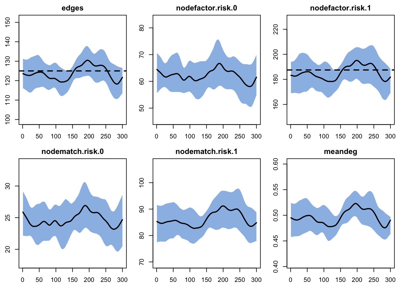
We can pull out specific terms, like edges and meandeg (mean degree), to plot separately, showing each of the 20 individual simulation lines.
Code
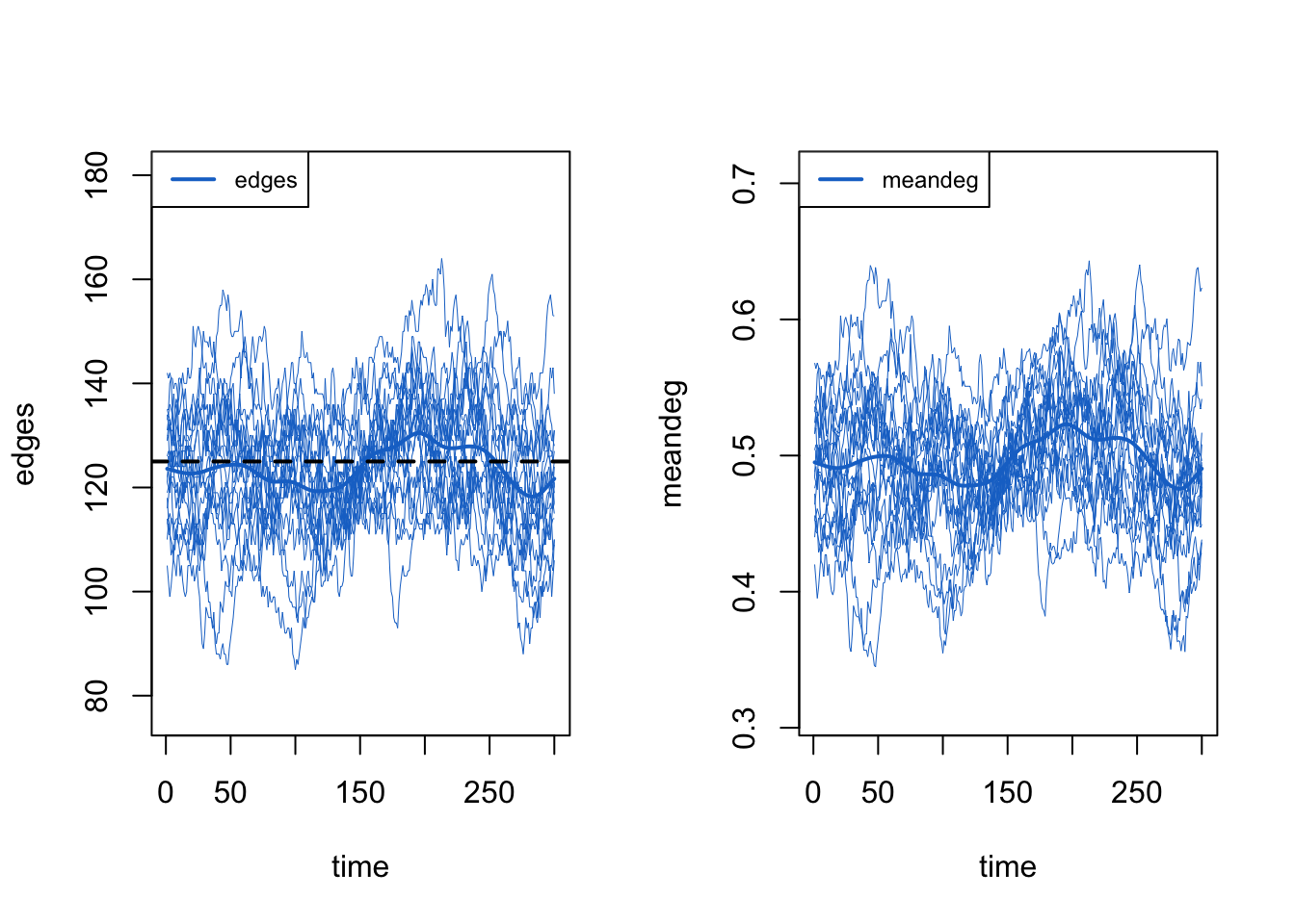
Overall, these diagnostics suggest that the exogenous vital-dynamic processes did not have unintended consequences on the network structure, which is the result we want.
37.3.5.2 Demographic outcomes
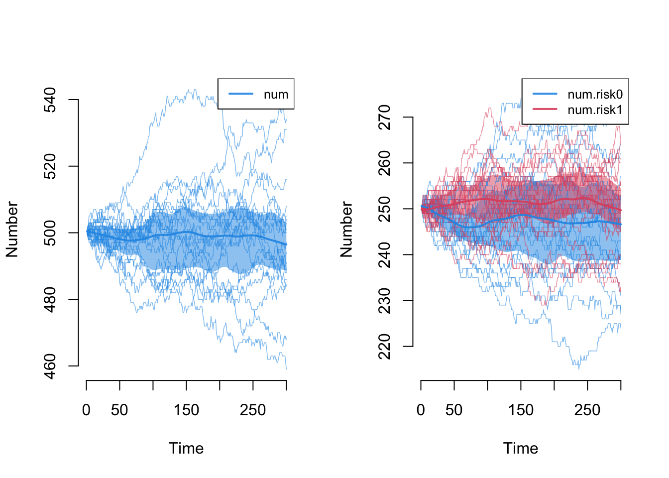
Next we explore the demographic outcomes that are now part of the epidemic processes. First, the overall population size, num, and the size by risk group. Because birth and death rates are balanced here, we expect the total to remain near 500 and the 50/50 split to hold, and they do (judged on the means across simulations; individual runs wander by tens of nodes).
One detail sits behind that split. Every arrival needs a risk value, and by default control.net assigns it in proportion to the current group sizes (its attr.rules argument defaults to "current"). That is why the split holds at 50/50 only on average while single runs wander: group composition follows a random walk that balanced rates keep centered but do not pin. If instead your arrivals should enter as a fixed stratum (a birth cohort, or a sex or age band that a node keeps for life), set control.net(attr.rules = list(risk = 0)) to give every arrival the fixed value 0, or attr.rules = list(risk = "t1") to draw from the initial distribution rather than the current one.
Code
Next, the flows for the three vital-dynamics processes. a.flow is the count of new arrivals, ds.flow the departures from the susceptible group, and di.flow the departures from the infected group.
Code
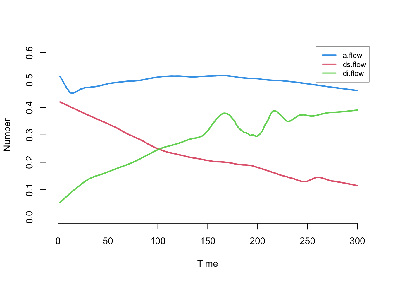
The arrival count is stable, right around the expected 500 * 0.001 = 0.5 per week. The two death-flow counts change over time because (as we will see) the number of susceptibles is shrinking as the number of infecteds grows.
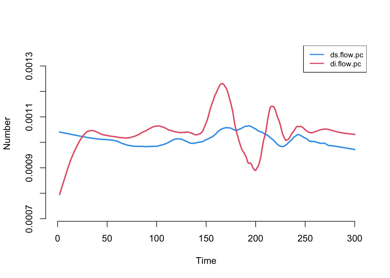
The raw departure counts are hard to read while the compartments themselves are changing size: a falling ds.flow could mean a lower per-capita death rate, or simply that fewer susceptibles remain to die. To separate the per-capita risk from the size of the pool, we compute per-capita death rates, dividing each departure flow by the current size of its compartment, and add them with mutate_epi. If the underlying per-capita departure rates are truly constant, these should be flat and equal.
With that added, we plot it. The rates converge to stable and equal values (with some fluctuation early, due to low numbers of infecteds).
37.3.5.3 Epidemic outcomes
Finally, the epidemic outcomes for disease prevalence. Overall prevalence is i.num.
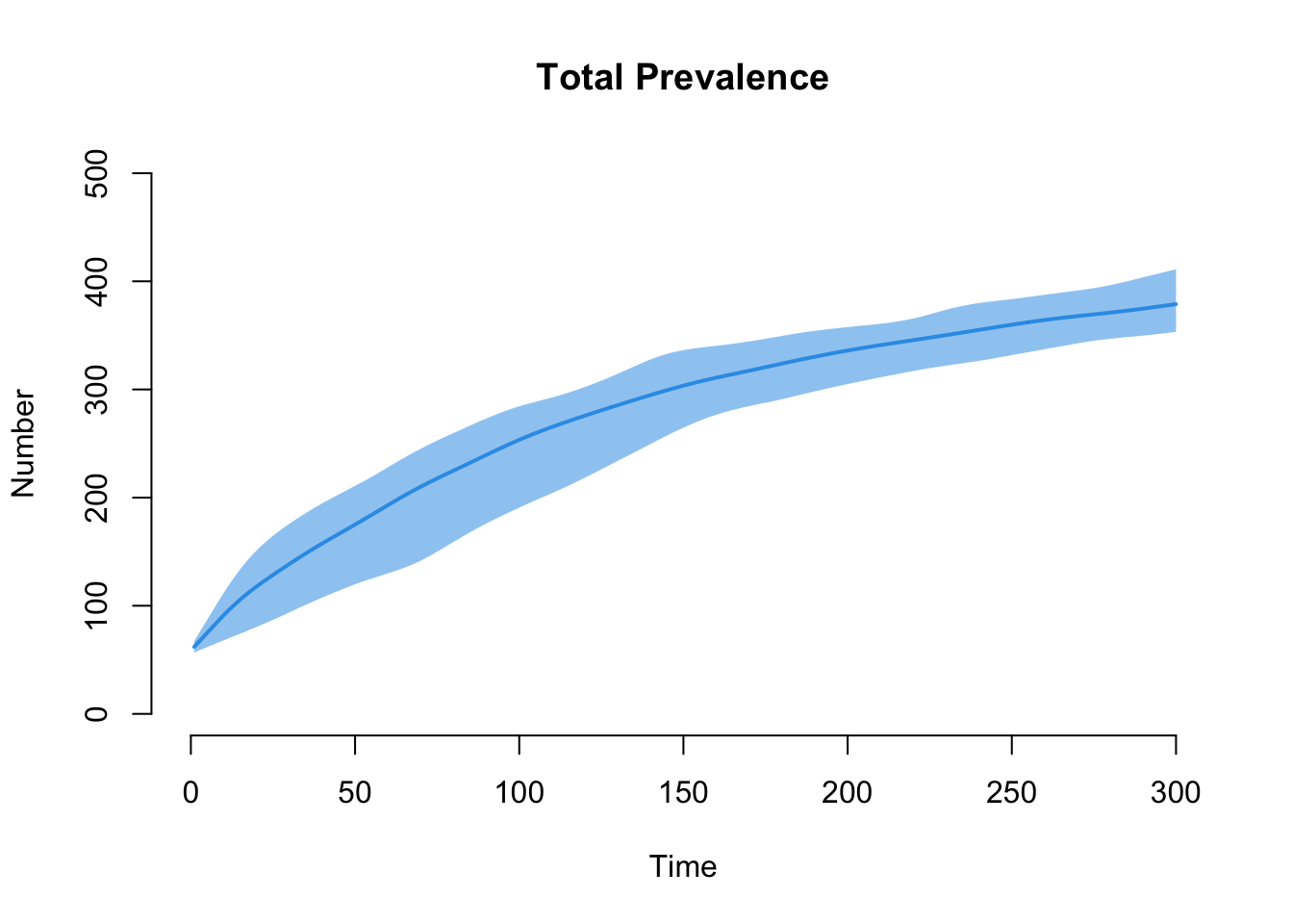
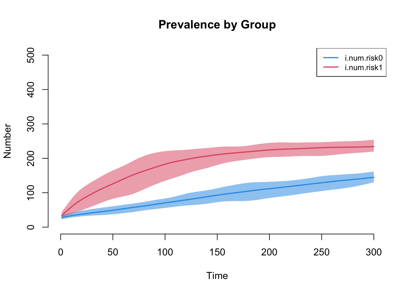
The next plot shows prevalence by risk group. Risk group 1, with the higher mean degree and strong assortative mixing, carries the higher prevalence.
37.3.6 Disease-specific mortality and the aggregate death correction
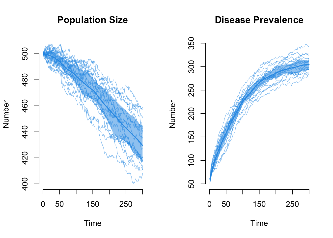
Now we let the disease shrink the population, as it did on the edges-only network, but this time on the heterogeneous network. We assume the mortality rate from disease is twice the natural rate: di.rate = 0.002 against ds.rate = 0.001. No other epidemic parameters change.
The formation target statistics need no change, but the d.rate in dissolution_coefs does: there are now two departure rates, and the death correction takes only one. On the edges-only network this was easy, because degree did not depend on status. Here it does. The correction needs to offset the ties that departures break, not the people who depart, and infected people depart faster and are concentrated in the higher-degree, higher-prevalence risk group, so each infected departure tends to break more partnerships than an average departure would. The departure rate that matters for edges therefore sits above the headcount average of the two rates. There is no tidy formula for it, because it depends on the equilibrium relationship between degree and disease status, which is itself an output of the simulation. So we find it by trial and error against the mean-degree diagnostic: if the correction matches the realized flow of departures, the mean degree holds flat at its target; if d.rate is too low, edges are under-corrected and the mean degree drifts downward.
We start with the simple average of the two departure rates, d.rate = 0.0015.
Plotting the mean degree from this first attempt shows it drifting below the target of 0.5. The simple average under-corrects, for the reason above: departures fall disproportionately on the higher-degree infected nodes, so they break more edges than their headcount share implies.
Code
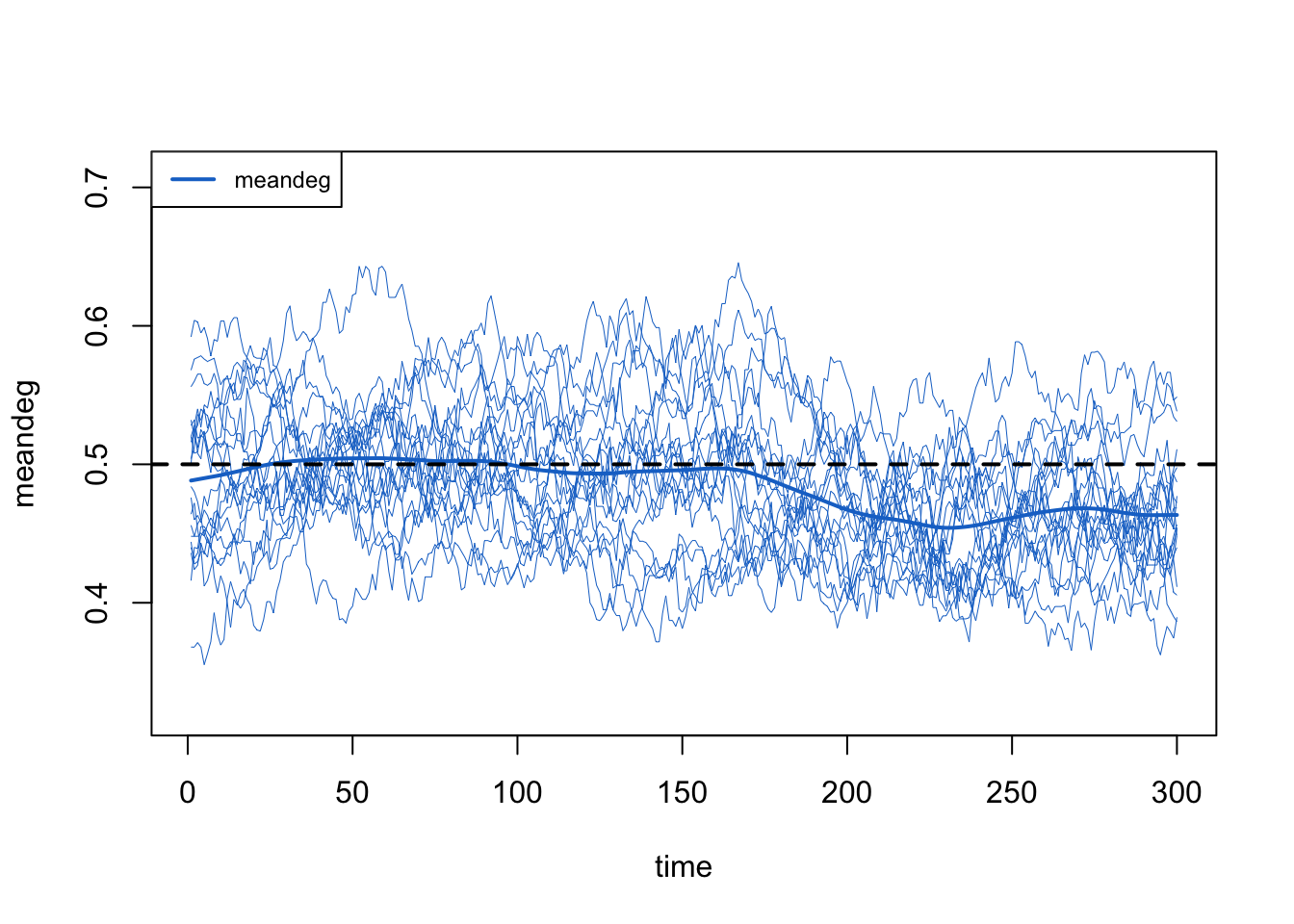
Raising d.rate and re-checking this same diagnostic, we settle on d.rate = 0.0018, which holds the mean degree flat (as we confirm at the end).
Code
Dissolution Coefficients
=======================
Dissolution Model: ~offset(edges)
Target Statistics: 40
Crude Coefficient: 3.663562
Mortality/Exit Rate: 0.0018
Adjusted Coefficient: 3.818895
Next, we re-estimate the network model and simulate the epidemic again.
First, the total population size. Now there is a steep decline as prevalence rises.
Code
The raw edges count declines as the population declines, exactly as it did on the edges-only network: edges are a function of mean degree and population size N, so as N falls the edge count falls with it.
Code
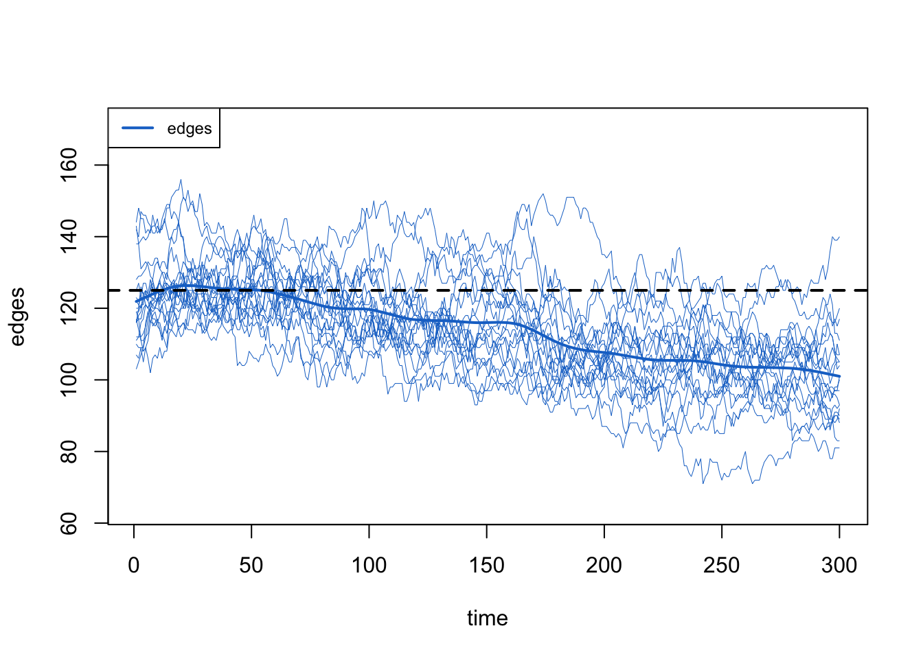
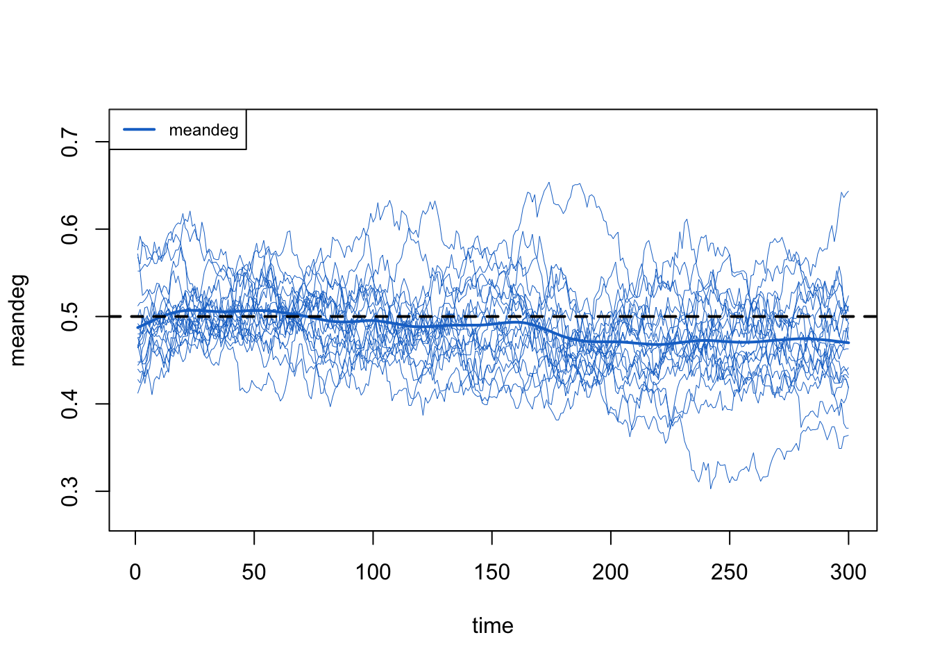
The network-size correction, meanwhile, holds the mean degree flat on its target even as the population shrinks, just as it did in the edges-only case. With both corrections working (the death correction through the tuned d.rate, and the network-size correction automatically), the mean degree stays flat.
Code
d.rate does, and does not, guarantee
d.rate is a single, homogeneous departure rate: dissolution_coefs takes one rate and builds one death correction from it. Once mortality actually differs by disease status (and, through the degree-status correlation, by risk group), no single d.rate is exactly right. The value we tuned to here, 0.0018, is an aggregate approximation: we raised it until the overall mean degree held flat, which is the diagnostic we can afford at production scale.
That flat overall mean degree is necessary but not sufficient. It tells us the total supply of edge-ends is being replaced at about the right rate on average. It does not tell us that the group-specific mean degrees, or the realized durations, are each on target: a correction that runs a little high for one group and a little low for another can flatten the overall average while leaving both group-level quantities off. Reading a single aggregate diagnostic as if it certified the whole model is an easy mistake to make. If group-specific degree or duration matter for your question, check them directly (or move to a model that corrects departures per group) rather than trusting the overall mean degree alone.
The next tutorial adds the last complication: letting disease status feed back onto the network, so that the structure the epidemic runs on is itself reshaped by the epidemic.