27 Dynamic Network Visualization
This tutorial demonstrates methods for dynamic visualization of the spread of infectious disease over networks using the ndtv package for R. ndtv is part of the larger Statnet suite of software for the representation, modeling, and analysis of network data. It has been designed to work with network-based epidemic modeling data from EpiModel.
Download the R script to follow along with this tutorial here.
27.1 Setup
We start by loading EpiModel and ndtv. The htmlwidgets library additionally allows for embedding ndtv movies into Quarto HTML pages like this (you do not need to install/load it for this course, but we need it to build this page).
We also set a single random seed so the tutorial is reproducible. One seed here at the top is enough: every model below draws from the same random-number stream, so setting it once fixes the results throughout. You can skip this line to get different results from the tutorial page.
In general, one primary goal of dynamic network visualization is to gain insight into how the structure of networks over time can influence transmission dynamics. This is different from estimating epidemic outcomes such as disease incidence or prevalence over time. The latter will typically require large networks (thousands of nodes) over large numbers of time steps (decades of time) with many hundreds or thousands of simulations. This allows for more accurate and stable estimation of outcome averages and spread. Dynamic visualization, on the other hand, usually only requires a single simulation of a small network size over a short number of time steps. That is because the visualization is meant to demonstrate the mechanisms rather than estimate the effects.
27.1.1 The Animation Pipeline
Every movie below is built the same way, out of an EpiModel simulation object. Two ideas make this work:
- A
networkDynamicobject is the network EpiModel simulates on, but with timing attached: it records when each edge is active and how each node’s attributes change over the course of the simulation. This is what lets us replay the epidemic step by step. - A temporally extended attribute (TEA) is a nodal attribute whose value can change over time. Disease status is the key example: a node is susceptible for the first part of the simulation and infected afterward, and a TEA stores that whole history rather than a single value.
With those in hand, each animation follows the same four steps:
get_network()extracts thenetworkDynamicobject from the simulatednetsimobject.color_tea()adds a TEA that assigns each node a color for its disease status at every time step.compute.animation()works out where to draw each node in every frame.render.d3movie()draws the frames and produces the interactive movie.
We build up five models below. They differ only in their formation and dissolution terms (the network structure); the four-step pipeline that turns each simulation into a movie is identical throughout.
27.2 Model 1: Edges-Only
27.2.1 Network and Epidemic Model
This shows an SI epidemic in a closed population where the infection probability is 1, and we will start to build up complexity in the network model step-by-step. We start with a network of 100 nodes, with an edges-only model in the formation and dissolution.
For the epidemic model, we will replicate the poker chip example in which the transmission probability per act is 100%. We could modify this to be a lower (more realistic for most diseases) value, but we choose a high value here to show a speedy epidemic spread. We simulate the model over 25 time steps with a single simulation.
27.2.2 Network Visualization
ndtv is an extension package in Statnet that allows for dynamic visualization for networks over time. Because this involves animation processing, this may require some heavy-duty computation.
27.2.2.1 Extract and Process the Networks
First we need to extract the network object from the larger netsim object. What we get back is a networkDynamic object, which carries the full timing of the simulation. Note that this object has details on the distinct time changes.
NetworkDynamic properties:
  distinct change times: 27
  maximal time range: 0 until  Inf

 Dynamic (TEA) attributes:
  Vertex TEAs:    testatus.active

Includes optional net.obs.period attribute:
 Network observation period info:
  Number of observation spells: 2
  Maximal time range observed: 0 until 26
  Temporal mode: discrete
  Time unit: step
  Suggested time increment: 1

 Network attributes:
  vertices = 100
  directed = FALSE
  hyper = FALSE
  loops = FALSE
  multiple = FALSE
  bipartite = FALSE
  net.obs.period: (not shown)
  vertex.pid = tergm_pid
  total edges= 92
    missing edges= 0
    non-missing edges= 92

 Vertex attribute names:
    active status tergm_pid testatus.active vertex.names

 Edge attribute names:
    active
Next, we need to add a time-varying nodal attribute to each network that we will animate. color_tea() attaches a temporally extended attribute (TEA), reading each node’s disease status at every time step and storing a color for it. The attribute it creates is literally named ndtvcol, which is why every render call below passes vertex.col = "ndtvcol" to color the nodes by status over time. See the help documentation for color_tea for the other available options.
27.2.2.2 Revisiting Static Visualizations
Before we start making a movie with this updated network object, recall the types of static visualizations of the co-evolving dynamic network and epidemic data that are possible with EpiModel. One approach is to extract and work with the transmission matrix within the netsim object.
# A tibble: 18 × 8
# Groups: at, sus [18]
at sus inf network infDur transProb actRate finalProb
<int> <int> <int> <int> <dbl> <dbl> <dbl> <dbl>
1 2 33 16 1 16 1 1 1
2 2 57 16 1 16 1 1 1
3 3 20 33 1 1 1 1 1
4 3 31 57 1 1 1 1 1
5 3 51 57 1 1 1 1 1
6 8 23 16 1 22 1 1 1
7 13 75 51 1 10 1 1 1
8 14 48 75 1 1 1 1 1
9 14 67 75 1 1 1 1 1
10 20 54 20 1 17 1 1 1
11 21 13 54 1 1 1 1 1
12 21 80 54 1 1 1 1 1
13 22 32 33 1 20 1 1 1
14 22 58 80 1 1 1 1 1
15 22 64 80 1 1 1 1 1
16 23 66 64 1 1 1 1 1
17 23 86 51 1 20 1 1 1
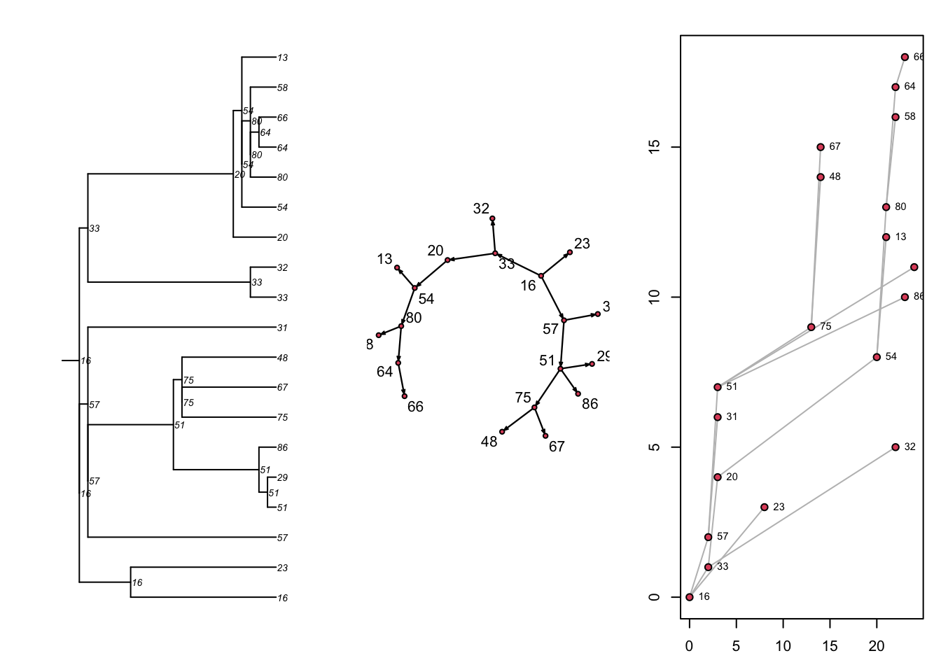
18 24 29 51 1 21 1 1 1Next, there are three built-in visualizations for the transmission matrix, as shown here. Previously we converted the transmission matrix into a phylo class object and plotted a phylogram with the ape package. Here, we are showing that we can also plot this transmat object directly as a phylogram, and also as two related formats. Each shows the time-directed chain of transmissions over time, starting with an initial seed. The middle plot is a directed network (showing who infected whom, here in a single large component because there was one seed). The right plot is a “transmission timeline” that plots the temporal time (the 25 time steps in our model) against generation time for transmissions.
Code
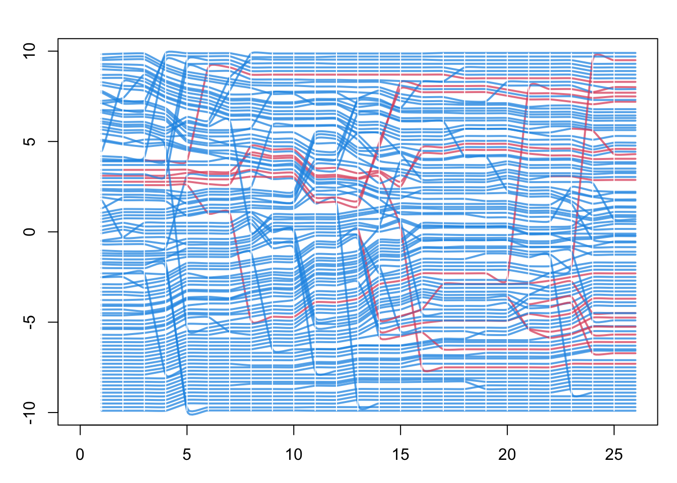
Finally, with the updated ndtv network object from above, we can plot a “proximity timeline”. To read this figure: the horizontal axis is simulation time, each line traces one node across time, and the lines are stacked vertically so that nodes close together in the contact network are drawn near each other. Line color is disease status, so an infection moving through a tightly connected cluster appears as a band of neighboring lines changing color at around the same time. Here the network is the full contact network, not just the transmission network of infected nodes. This helps identify the micro-outbreaks of infection that are occurring within sub-clusters of the network with greater closeness.
27.2.2.3 Dynamic Network Movie
The animation is controlled by three lists of settings. slice.par chooses which time steps to show and how to bin the dynamic edges into each frame, render.par controls the smoothness and labeling of playback, and plot.par sets the plot margins. Here we animate the first 25 time steps. Consult the main ndtv vignette for the full set of options.
Code
# Which time steps to animate, and how to bin edges into each frame
slice.par <- list(start = 1,          # first time step to show
                  end = 25,           # last time step to show
                  interval = 1,       # advance one time step per slice
                  aggregate.dur = 1,  # width of the time window collapsed into each slice
                  rule = "any")       # include an edge if it is active anywhere in that window

# How the playback itself is rendered
render.par <- list(tween.frames = 10,  # interpolated frames between slices, for smooth motion
                   show.time = FALSE)   # do not print the time-step label on each frame

# Plot margins: zero, so the network fills the frame
plot.par <- list(mar = c(0, 0, 0, 0))
This step figures out where the nodes should be displayed in each animation frame. By default it uses the Kamada-Kawai force-directed layout, which pulls connected nodes together and pushes unconnected nodes apart. The absolute coordinates carry no meaning (there are no axes to read); only the relative positions of nodes matter. The layouts are also chained from one frame to the next, so each frame starts from the previous positions and the nodes do not jump around as the movie plays.
Finally, we render the animation. render.d3movie can return its output two ways. The first writes a standalone HTML file with the filename argument, using d3 JavaScript; this makes for nice-looking animations you can open in a browser, and is what the downloadable script does. See the ndtv help for all the potential options in this step.
The second way is to embed the movie directly in a Quarto page like this one, by setting output.mode = "htmlWidget" instead of filename. The two calls are otherwise identical. This tutorial page uses the embedding version, so the movie appears inline below.
27.3 Model 2: No Concurrency
Let’s return to the core network model and experiment with extra terms, and then run the movie again. Here we add the concurrent term, which counts the number of nodes that have two or more partners at the same time (a momentary degree of 2 or higher). Concurrency is the overlap of partnerships in time, and it speeds transmission because an infection can pass across an overlapping partnership without waiting for one relationship to end before the next begins.
Before choosing a target statistic for concurrent, it helps to know how many concurrent nodes we would expect by chance. Our edges-only target of 40 edges in a network of 100 nodes implies a mean degree of 2 * 40 / 100 = 0.8:
If partnerships formed at random, the number of partners per node would be approximately Poisson with this mean, so the expected fraction of nodes with two or more partners is the upper tail of that distribution. Multiplying by the 100 nodes gives the expected count:
So roughly 19 nodes would be concurrent by chance. We can now set the concurrent target above or below this value and see how it plays out in the movie. The target is constrained, though: you cannot force a large number of concurrent nodes when the mean degree is only 0.8, so if the target is too high the model will not fit. The model terms and their target statistics must be compatible.
27.3.1 Network and Epidemic Model
In this example, we select an extreme concurrency statistic of 0 (no nodes exhibit concurrency).
Code
Warning: 'glpk' selected as the solver, but package 'Rglpk' is not available;
falling back to 'lpSolveAPI'. This should be fine unless the sample size and/or
the number of parameters is very big.
We use the same epidemic parameters as above, but you can experiment with these too now.
27.3.2 Static Transmission Output
Let’s just look at what the static transmission outputs look like without network concurrency but with the same epidemic parameters. This network with much more sparse connectivity results in a transmission tree that is also sparser.
27.3.3 Dynamic Network Movie
We follow the same steps to make the movie. Notice here that nearly all nodes are connected within a dyad, and therefore that no concurrency implies few isolates given this relatively high mean degree (0.8). In fact, the logical maximum mean degree in a network with no concurrency is 1.0: if no node may have more than one partner, the edges can only form a set of disjoint pairs (a matching), so there are at most N / 2 edges among N nodes, which is a mean degree of one. Notice how this “serial monogamy” constrains the speed of epidemic spread. The same constraint operates well beyond STIs: whenever contacts happen strictly one at a time (a home care aide who finishes with one client before visiting the next, say), an infection must wait for one tie to dissolve before it can travel along the next.
27.4 Model 3: Relational Duration
One feature of network models is to represent persistent relationships, in which there are repeated contacts between the same set of persons over time. This involves modeling the incident formation and persistence of edges over time. We can also model the extremes of relational duration to see its impact on epidemic potential.
27.4.1 Model 3a: Very Long Durations
Here we use the same model as Model 1, but set the duration to 100,000 time steps. This effectively makes all edges fixed over the 25 simulation time steps.
We use the same epidemic parameters as above.
We follow the same steps to make the movie. Nothing much happening, even with a transmission probability of 100%.
27.4.2 Model 3b: Short-Duration Contacts
Here we use the same model as Model 1, but set the duration to 2 time steps. This makes edges randomly dissolve with high probabilities at each time step.
We use the same epidemic parameters as above.
Yikes! There is not only massive turnover in the edges at each time step (which makes the visualization a jumble of moving nodes), but the epidemic quickly reaches a saturation point.
27.5 Model 4: Triangles
Next let’s try another model where we add extra “triangles”: clusters of three people connected together in a local group. A raw triangle term tends to make these models numerically unstable (degenerate), so we instead use gwesp, the geometrically weighted edgewise shared partner term, which is the well-behaved way to build triangle-like clustering into an ERGM. We call it as gwesp(0, TRUE): the first argument is the decay parameter, set to 0, and the second (fixed = TRUE) holds the decay fixed rather than trying to estimate it. With the decay fixed at 0, the statistic simplifies to the number of edges that have at least one shared partner, and each such edge closes at least one triangle. The null value for this statistic is less than 1, so we ramp it up to a target of 25 (asking that 25 of the 40 edges sit in a triangle) and see what happens. We recycle the same epidemic parameters from the model above.
We follow the same steps to make the movie. Notice the distinct triangle formation in the network edges. Are triangles associated with faster or slower epidemic spread?
27.6 Model 5: Extra Nodal Attributes
Finally, we show an example of how to work with additional vertex attributes within the model. Rather than the special group attribute (which encodes only a single two-way split of the population), here we show how to use other, non-special nodal attributes in combination.
In this model, we want to parameterize a network model in which two attributes are represented: age and “community”. One can think of community in terms of any geographical, demographic or social dimension that has an impact on contact patterns relevant to a given infectious disease. Community will be a single binary variable (0 and 1), whereas age will be an integer in years between 18 and 50. We use R’s built-in random sampling functions to generate values for these attributes and then set them on the network object.
Code
 Network attributes:
  vertices = 100
  directed = FALSE
  hyper = FALSE
  loops = FALSE
  multiple = FALSE
  bipartite = FALSE
  total edges= 0
    missing edges= 0
    non-missing edges= 0

 Vertex attribute names:
    age community vertex.names

No edge attributes
This will be the most complex TERGM formula that we have seen so far. It chains several ERGM terms together in one formation model, each with its own target statistic supplied in the same order in target.stats:
edgessets the overall number of edges. The target of 50 gives a mean degree of 1 (50 * 2 / 100).nodematch("community")counts the edges whose two nodes are in the same community. The target of 40 means 40 of the 50 edges are within-community, so only 10 bridge the two communities.nodefactor("community")lets mean degree differ by community. Its statistic is the summed degree of the nodes in the non-reference group;nodefactoruses the lowest value of the attribute (community = 0) as the reference by default, so the target of 70 is the total degree of thecommunity = 1nodes. With roughly 50 such nodes (sincecommunitycomes fromrbinom(100, 1, 0.5)), their mean degree is about70 / 50 = 1.4, above the network-wide average of 1.absdiff("age")is a mixing term likenodematch, but for a continuous attribute. Its statistic is the sum of the absolute age differences across the tied dyads (the 50 edges, not allchoose(100, 2) = 4950possible dyads). A target of 100 over 50 edges means partners are on average 2 years apart in age, giving strong age assortativity.concurrentcounts nodes with two or more simultaneous partners. The target of 30 sets the level of concurrency.
The dissolution model has two terms as well: edges average 20 time steps in relationships not matched on community, and 10 time steps in relationships matched on community, so within-community ties are both more common and shorter-lived.
Code
formation <- ~edges + nodematch("community") + nodefactor("community") +
              absdiff("age") + concurrent
target.stats <- c(50, 40, 70, 100, 30)
coef.diss <- dissolution_coefs(dissolution = ~offset(edges) + offset(nodematch("community")),
                               duration = c(20, 10))
est <- netest(nw, formation, target.stats, coef.diss)
Phew! The epidemic model is simple, and parameterized as before, except that we now seed the epidemic with 10 initial infections.
The first steps of making the network movie are the same as before, reusing the slice.par, render.par, and plot.par settings defined for Model 1.
But to visualize community and age in the movie, we will extract the attributes back from the network object. And then scale them for appropriate visuals. We convert community into two numbers, 4 and 50, which will represent the number of sides in the node (so: a square and effectively a circle). We scale age by a factor of 1/25 to allow the node size to be a simple function of age.
And here’s our final movie!
27.7 Takeaways
Across the five models we changed only the formation and dissolution terms and watched how the epidemic movie responded:
- Concurrency (Model 2) speeds spread by holding overlapping partnerships open at the same time; removing it (“serial monogamy”) slows the epidemic.
- Relational duration (Model 3) matters at both extremes: very long partnerships lock the infection inside a few components, while very short ones churn contacts so quickly that the epidemic saturates.
- Local clustering (Model 4, via
gwesp) concentrates transmission within triangles. - Nodal attributes (Model 5) let contact patterns depend on who people are (community and age here), shaping which subgroups the infection reaches.
The broader point is that dynamic visualization is a tool for building intuition about mechanism. A single small, short simulation makes visible how a change in network structure changes transmission, in a way that summary epidemic curves alone do not. We do not have a separate lab for this module; instead, the exercise is to return to any of the models above, change one target statistic or one duration, re-run the movie, and predict before you watch how the epidemic should differ.