32 Epidemic Models with Demography
This tutorial demonstrates how to model a Susceptible-Infected (SI) epidemic in an open population. An example of an SI epidemic is HIV, with infected persons never leaving the infected stage before mortality. Modeling HIV is quite complicated, and this tutorial is not meant to be a full-scale HIV model: it does not include many components of HIV models, such as disease stage, drug therapy, and so on. This only represents SI dynamics generally with the possibility of vital dynamics.
The population is open because we are now including arrivals and departures in the epidemic process. Simulating an epidemic in an open population requires adjustments that accommodate changes to the network structure over time, as detailed in the Module 8 slides.
For simplicity and to keep the overall population size stable, our initial example will have the departure processes not depend on disease status (no disease-dependent mortality). We will then show the implications of the “death correction” to the estimation to demonstrate why we implement that model correction, and finally explore models in which the population size does vary.
Unlike in the tutorial in Module 5, we are using an attribute here but not the special group attribute. So we will allow for heterogeneity in network structure but assume homogeneous epidemic parameters. It is straightforward to extend EpiModel (we will cover this in Module 9) to allow for any arbitrarily specified attributes to impact both the network structure and epidemic processes.
Download the R script to follow along with this tutorial here.
Start with loading EpiModel:
32.1 Network Structure
The network is initialized as before, but now we set a vertex attribute of risk group onto the network. Risk group will be a binary variable, with the risk groups evenly sized in the population.
We will proceed by fitting network model in which Risk Group 1 has a higher mean degree and there is strong assortative (within-group) mixing (aka, homophily).
32.2 Model 1: Stable Population Size
The first model will assume that there is random mixing in the population, with no preference for same-risk partnerships, and that the two risk groups have the same mean degree. In fact, this means that there is no need to include separate terms for degree and homophily in the network model (it is an edges-only model or Bernoulli random graph).
32.2.1 Network Parameterization
We we will add heterogeneity in mean degree by risk group and for homophily in risk group mixing by using nodefactor and nodematch terms and associated target statistics.
The formula for the formation component of the model will be as follows. The nodefactor term represents variation in the overall mean degree by the named attribute, risk. The nodematch represents mixing by that named attribute.
The overall mean degree will be 0.5, but will vary by risk group. We will specify that the mean degree for risk group 1 is 0.75. Because the overall mean degree is 0.5, and the proportions of risk groups is equal, that implies that the mean degree for risk group 0 will be 0.25.
The target statistic for the nodefactor term is the product of the mean degree of risk group 1 and the size of risk group 1: 0.75 * 250 = 187.5. Finally, we will specify that 90% of the partnerships occur between persons of the same risk group, which equals 112.5 edges.
The dissolution model components will be as follows. We specify a homogeneous dissolution model with an average relational duration of 40 weeks. The dissolution coefficients must be adjusted to accommodate the exogenous probability of edge dissolution due to mortality (or other forms of nodal departure) – this is the “death correction. As shown in the Module 8 Slides, this adjustment has the impact of increasing the coefficient. Recall that this is because the dissolution model is actually implemented as a persistence model: a larger coefficient = longer partnerships.
Code
Dissolution Coefficients
=======================
Dissolution Model: ~offset(edges)
Target Statistics: 40
Crude Coefficient: 3.663562
Mortality/Exit Rate: 0.001
Adjusted Coefficient: 3.7469
The d.rate parameter here is the average mortality (or other departure) rate per time step. This will correspond to the epidemic parameters specified below in param.net. In the case that there is disease-induced mortality, this parameter should represent a weighted average of the different departure rates in the full system (we will explore this below).
In this tutorial example a d.rate parameter of 0.001 corresponds to an average “lifespan” (time spent in the population) of 1/0.001 = 1000 time steps. This is probably unrealistic for most disease models (especially since the average relations last 40 time steps), but we are using a small value of lifespan for demonstration purposes. In fact, you may encounter the following message if the departure rate is too high relative to the average relational duration.
In this test case below, the average “lifespan” is half as long as the average relationship (which probably doesn’t make any sense). We have tried to catch this problem for you with an informative error message.
Ok, so let’s use our smaller d.rate parameter of 0.001.
32.2.2 Estimation and Diagnostics
The network model is estimated using the netest function with all the inputs we specified above.
We can use the summary function to display the coefficient estimates for the nodefactor and nodematch terms, which are strong (> 0 on the log odds scale) and highly significant. The specific values of those coefficients do not matter much here (what matters is how they generate simulations of the complete network, below), but the positive sign of both terms shows these are greater than expected than under the null model, precisely as we have parameterized them.
Call:
ergm(formula = formation, constraints = constraints, offset.coef = coef.form,
    target.stats = target.stats, eval.loglik = FALSE, control = set.control.ergm,
    verbose = verbose, basis = nw)

Monte Carlo Maximum Likelihood Results:

                  Estimate Std. Error MCMC % z value Pr(>|z|)
edges              -9.1317     0.2898      0 -31.509   <1e-04 ***
nodefactor.risk.1   0.6115     0.1120      0   5.461   <1e-04 ***
nodematch.risk      2.0328     0.2927      0   6.946   <1e-04 ***
---
Signif. codes:  0 '***' 0.001 '**' 0.01 '*' 0.05 '.' 0.1 ' ' 1
Log-likelihood was not estimated for this fit. To get deviances, AIC, and/or BIC, use ‘*fit* <-logLik(*fit*, add=TRUE)’ to add it to the object or rerun this function with eval.loglik=TRUE.
Dissolution Coefficients
=======================
Dissolution Model: ~offset(edges)
Target Statistics: 40
Crude Coefficient: 3.663562
Mortality/Exit Rate: 0.001
Adjusted Coefficient: 3.7469
For the diagnostics for this model, we set the nwstats.formula to expand the formation formula to specify that we want to monitor the mean degree and mixing by the risk attribute. We do this with nodefactor and nodematch terms, respectively. By adding them to the nwstats.formula, but not in the formation formula for the TERGM itself, we can get summary statistics for simulations to see what the expected values of these terms would be in a null model. Setting levels = NULL in the nodefactor term will output statistics for both risk groups in the model.
We can also monitor the nodematch term with a diff = TRUE argument, which allows for differential homophily by group. In this model, there would never be a reason to specify differential homophily by group in the ERGM formula because it would be over-specified: because it is a binary attribute, individual diagonal cells are a function of edges and nodefactor terms. It can be used for models either without a nodefactor term, or for models with nodefactor terms but with a mixing attribute with more than two levels. But again we show it here for comparison, and getting you familiar with the different syntax options.
Printing the diagnostics shows a good fit between the targets and the simulated outputs. There is no difference between the simulated means for nodefactor statistics for risk group 0 compared to risk group 1, indicating no differential in mean degree by risk group.
EpiModel Network Diagnostics
=======================
Diagnostic Method: Dynamic
Simulations: 10
Time Steps per Sim: 1000

Formation Diagnostics
-----------------------
                  Target Sim Mean Pct Diff Sim SE Z Score SD(Sim Means)
edges              125.0  125.796    0.637  0.909   0.876         3.475
nodefactor.risk.0     NA   64.924       NA  0.970      NA         1.593
nodefactor.risk.1  187.5  186.669   -0.443  1.514  -0.549         6.638
nodematch.risk.0      NA   26.243       NA  0.489      NA         0.871
nodematch.risk.1      NA   87.116       NA  0.734      NA         3.151
                  SD(Statistic)
edges                    11.502
nodefactor.risk.0        11.459
nodefactor.risk.1        19.299
nodematch.risk.0          5.514
nodematch.risk.1          9.379

Duration Diagnostics
-----------------------
      Target Sim Mean Pct Diff Sim SE Z Score SD(Sim Means) SD(Statistic)
edges     40   39.675   -0.812  0.287  -1.131         1.161         3.458

Dissolution Diagnostics
-----------------------
      Target Sim Mean Pct Diff Sim SE Z Score SD(Sim Means) SD(Statistic)
edges  0.025    0.025   -0.305      0  -0.539             0         0.014
Plotting the diagnostics shows that the simulations are right on target for the terms in the formation model. We will skip plotting the dissolution model diagnostics for this example.
Recall that this TERGM estimation and diagnostics has not yet been confronted with the complexities of an open population in which there is arrival and departure. So we should not expect any challenges with corrections to any changing population or mortality, because the population size and composition remains fixed during this step. Only when we move on to the next step of the epidemic simulation do these exogenous process introduce these factors.
32.2.3 Epidemic Simulation
This epidemic simulation will investigate how variation in mean degree by risk group and highly assortative risk group mixing jointly impact epidemic prevalence overall and by risk group. We will use one set of epidemic parameters, initial conditions, and control settings shared across the two counterfactual models.
The parameters are entered into the param.net function should be familiar by now. Since this is an SI epidemic, there will be no recovery rate parameter. The three new parameters will control the arrival rate, departure rate among the susceptibles, and departure rate in the infected group. Note that this is the same departure rate as what we specified in dissolution_coefs. For this step, we will assume that all three rates are equal, which implies that there is no disease-induced mortality and a stable population size.
Similar to the previous tutorial, we only need to specify the number infected at the outset. To generate stable epidemic conditions quickly, we will see that the prevalence is 10%, distributed randomly among the population.
The inputs for the control settings share some similarities with the control settings from the Day 3 tutorials, but we will be adding some new parameters here:
-
resimulate.network: this argument specifies that the network should be resimulated timestep-by-timestep in the model, in response to changing conditions like demography. By default this argument isFALSE, so here we must set it toTRUE. -
epi.by: this argument provides stratified prevalence estimates by a categorical attribute in the network (if we had used the specialgroupattribute, stratified estimates would be available by group by default). By default, this argument isNULL. -
tergmLite: this is a streamlined approach for network simulation that speeds up the process by 20-50 fold. This is possible because of trade offs between complete versus sparse representation of the underlying network object. By default this is set toFALSE, which means that the full network object is retained. With tergmLite methods, this means that the full network object cannot be plotted at different time points (because the individual-level network history is not retained). Otherwise, the two methods should be equivalent.
For the main epidemic model comparison, we are going to run 20 simulations on 10 cores with tergmLite = TRUE. Note that we are using the nwstats.formula argument to add a couple of network terms to monitor for the post-simulation diagnostics.
To simulate the epidemic model, we again use the netsim function.
32.2.4 Epidemic Model Analysis
Our model analysis will consist of model diagnostics, and then the examination of the epidemiological outcomes overall and by risk group.
32.2.4.1 Post-Simulation Diagnostics
It is important to first examine the network model diagnostics after the epidemic simulation, since the vital dynamics within these simulations may have changed the structure of the network in unexpected ways.
Printing the netsim output object shows its contents. The output compartments now include the post-simulation diagnostics, similar to the output from a netdx object (pre-simulation diagnostics).
EpiModel Simulation
=======================
Model class: netsim
Simulation Summary
-----------------------
Model type: SI
No. simulations: 20
No. time steps: 300
No. NW groups: 1
Fixed Parameters
---------------------------
inf.prob = 0.1
act.rate = 5
a.rate = 0.001
ds.rate = 0.001
di.rate = 0.001
groups = 1
Model Output
-----------------------
Variables: sim.num s.num s.num.risk0 s.num.risk1 i.num
i.num.risk0 i.num.risk1 num num.risk0 num.risk1 si.flow
ds.flow di.flow a.flow
Networks: sim1 ... sim20
Transmissions: sim1 ... sim20
Formation Statistics
-----------------------
Target Sim Mean Pct Diff Sim SE Z Score SD(Sim Means)
edges 125.0 125.309 0.247 1.104 0.280 6.855
nodefactor.risk.0 NA 61.416 NA 0.967 NA 5.375
nodefactor.risk.1 187.5 189.202 0.907 1.919 0.887 10.927
nodematch.risk.0 NA 24.456 NA 0.440 NA 2.334
nodematch.risk.1 NA 88.348 NA 0.888 NA 5.035
meandeg NA 0.500 NA 0.004 NA 0.024
SD(Statistic)
edges 12.612
nodefactor.risk.0 10.586
nodefactor.risk.1 21.469
nodematch.risk.0 4.901
nodematch.risk.1 10.204
meandeg 0.047
Duration and Dissolution Statistics
-----------------------
Not available when:
- `control$tergmLite == TRUE`
- `control$save.network == FALSE`
- `control$save.diss.stats == FALSE`
- dissolution formula is not `~ offset(edges)`
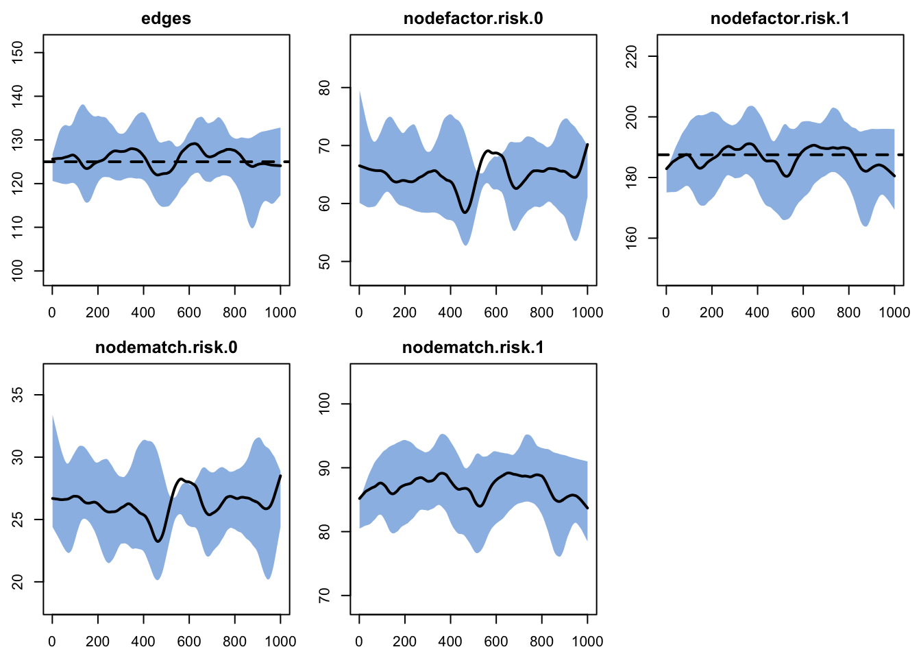
- `keep.diss.stats == FALSE` (if merging)Note that even with the introduction of vital dynamics (births and deaths), the simulation means are very close to the target statistics. While there may be a small difference here, it is quite small on the absolute scale (3-5 edges per time step), which is due to the smaller sample size (smaller network and low number of simulations) rather than a model bias. Note that dissolution statistics are not currently available in this model, but something that we plan to add in the future.
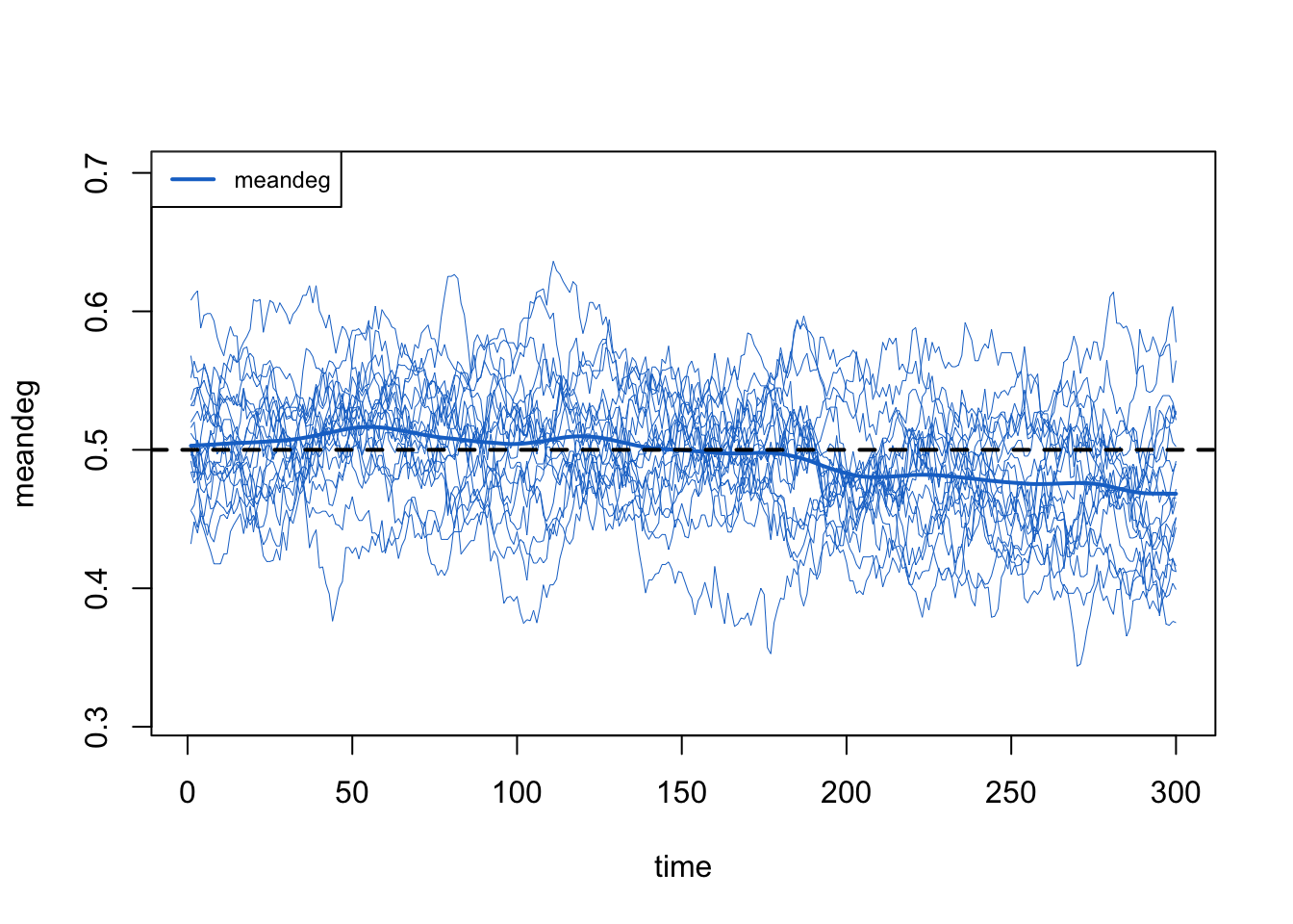
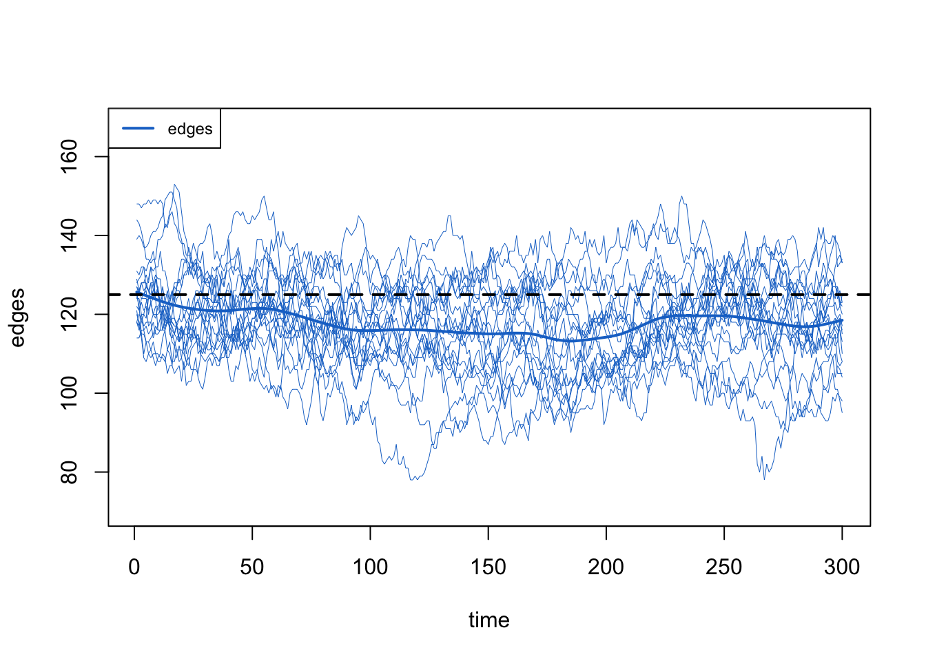
Here we show how to plot model diagnostics recorded within the netsim object. Although we have saved all the network statistics in the formation formula, here we plot the number of edges over time. We are happy with the diagnostics because the interquartile range of the simulations overlaps with the target statistic lines.
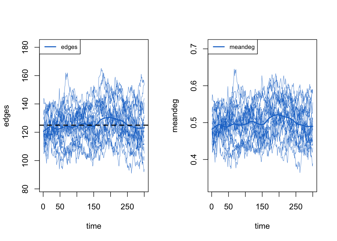
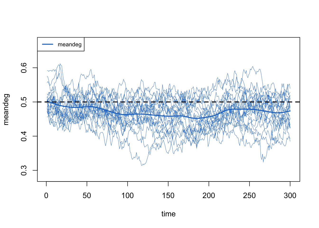
We can also pull out one specific formula term, like edges and meandeg (for mean degree), to plots separately here. We also show the unique values of each of the 10 simulations.
Code
Overall, these diagnostics suggest that any of the exogenous vital dynamic processes that we added to the model did not have unintended consequences on the network structure. Good news!
32.2.4.2 Demographic Outcomes
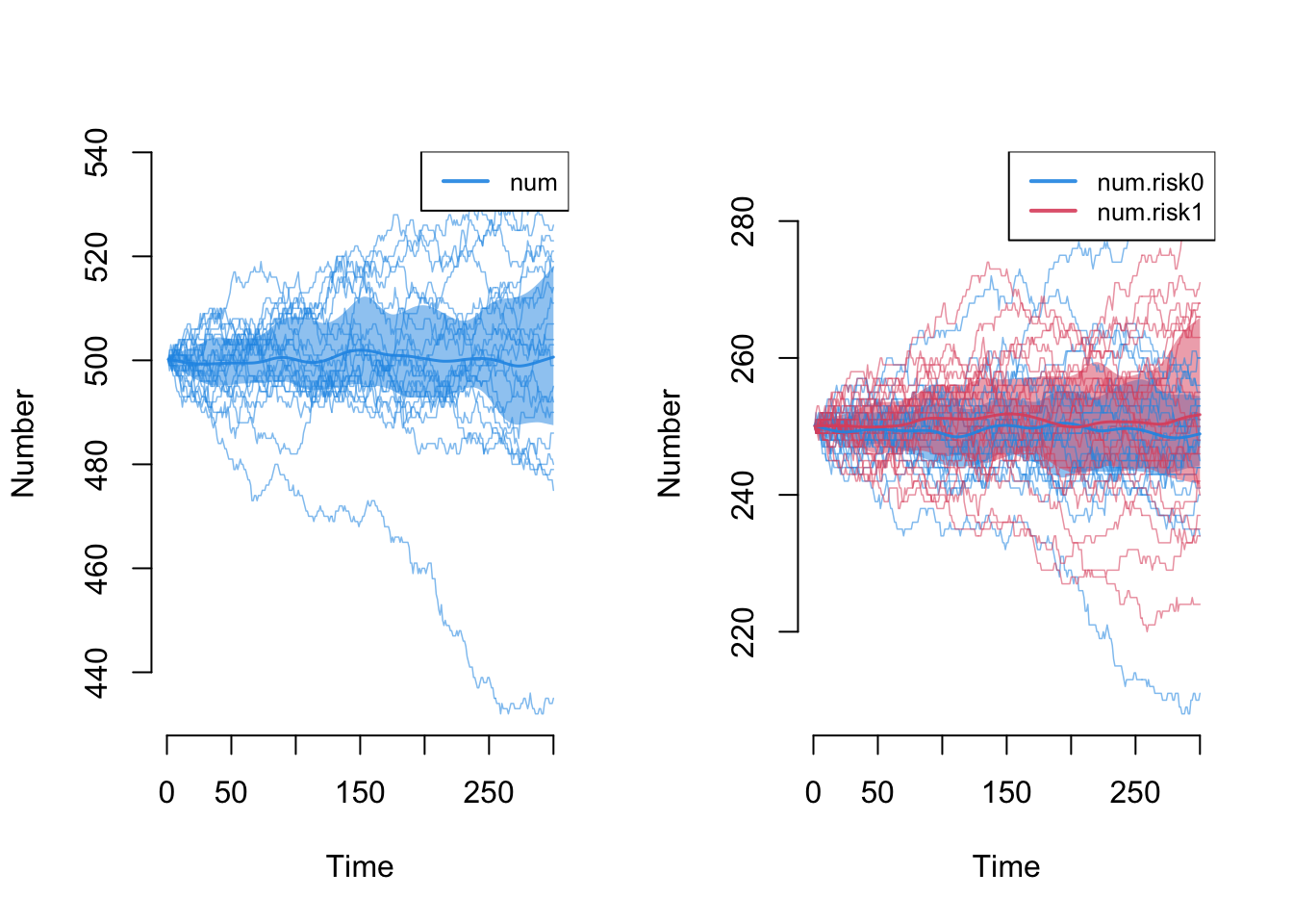
Next, let’s explore the demographic outcomes that are now part of the epidemic model processes. First, we can look at the overall population size, num, and the population size by risk group attribute. Because we have balanced birth and death rates, we expect the total population size to remain stable at 500 (our initial network size); it does! We also expect that the 50/50 distribution of the two groups to remain stable; it does!
Code
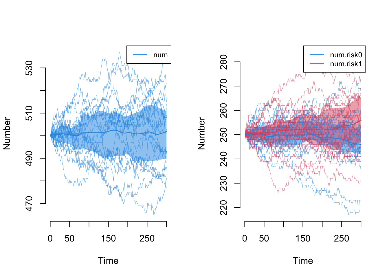
Note however that we are evaluating stability based on the means across simulations. Some individual outlier simulations has the population changing +/- 30 nodes, and the same goes for the risk group-specific numbers. That’s ok.
Next, we can look at the flows for the three vital dynamics process. a.flow is the count of new arrivals into the model, ds.flow is the number of departures from the susceptible group, and di.flow is the number of departures from the infected group.
Code
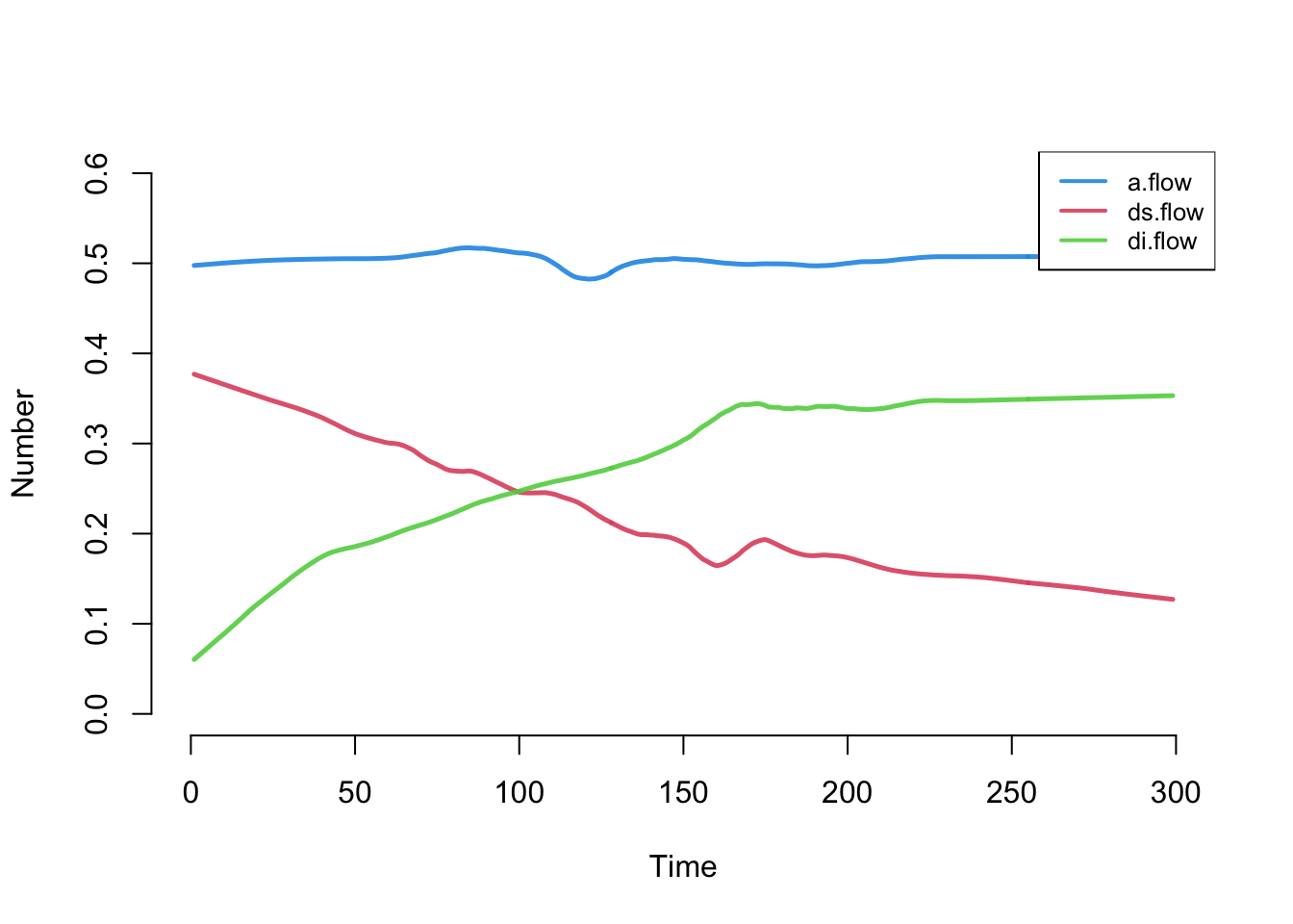
The overall count for the arrivals is stable, and right around the expected value of 0.5 per time step (because the per capita arrival rate is 0.001 and the population size is 500, then 500 * 0.001 = 0.5). The two death flow counts are changing. Why? Because (as we will see below), the state size of the susceptibles is shrinking as the state size of the infecteds is growing.
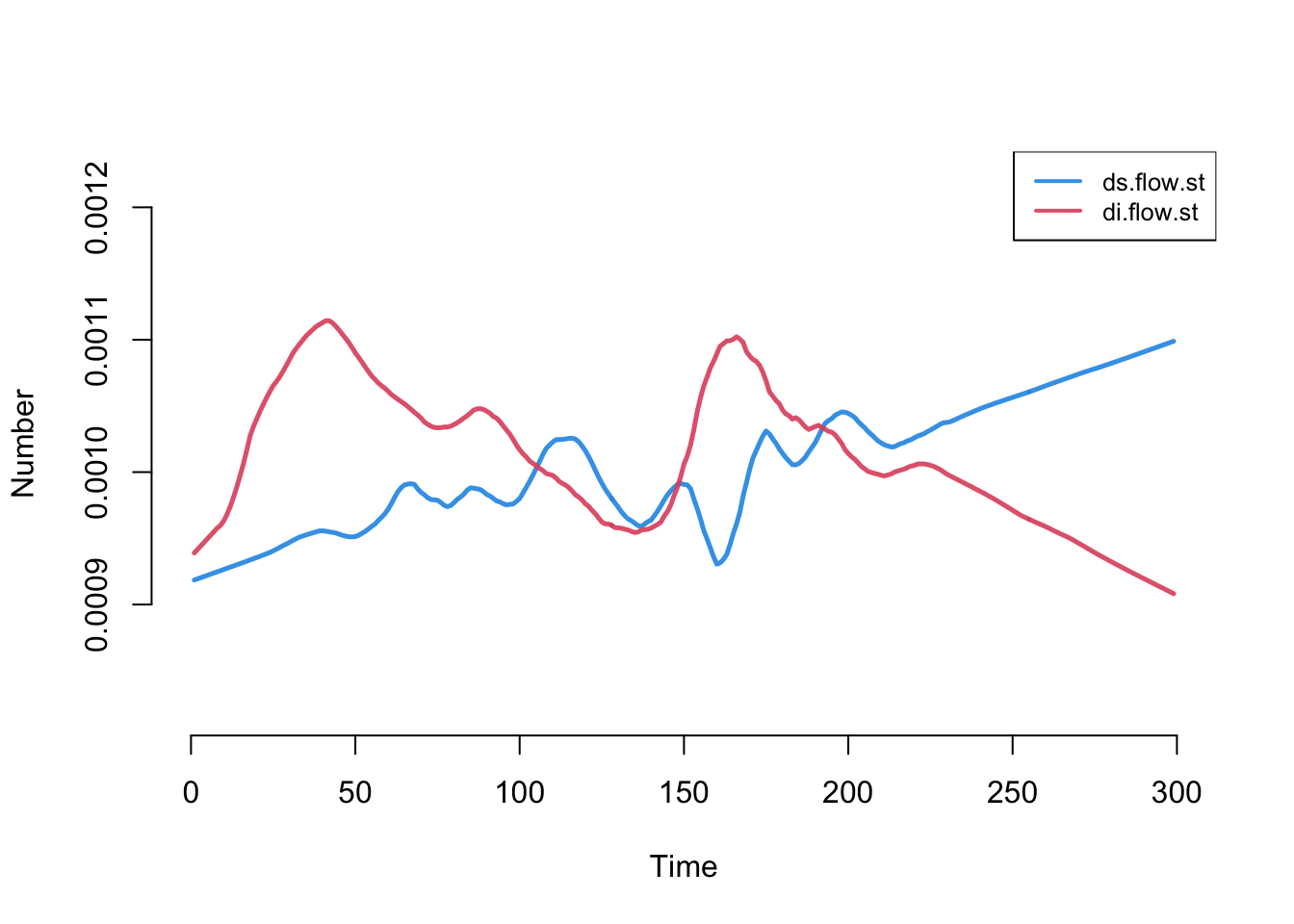
To demonstrate this changing epidemiology, we can calculate standardized death rates, and add them to the model object using the mutate_epi function.
With that added, let’s plot it. Now, the numbers converge to stable and equal values (however there is some flucuation at the beginning of the model due to low numbers of infecteds).
32.2.4.3 Epidemic Outcomes
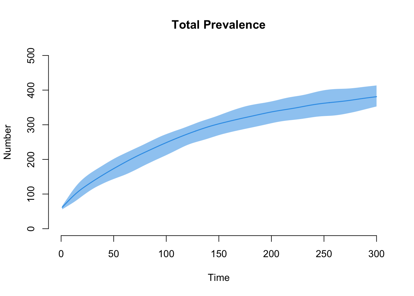
Finally, let’s take a look at the epidemic outcomes for disease prevalence. Overall, total population prevalence is contained in i.num, and we can plot that here.
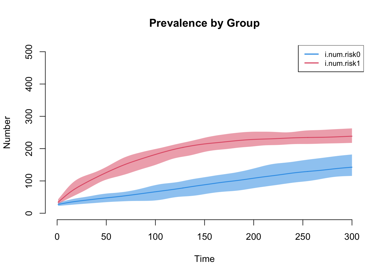
The next plot shows the prevalence by risk group. Our model demonstrates that Risk Group 1, with the higher mean degree and strong assortative mixing, has the higher disease prevalence.
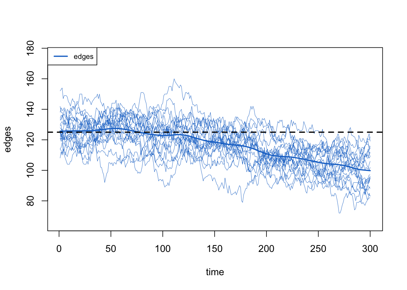
32.3 Model 2: Impact of Death Correction
To clearly demonstrate the importance of the “death correction” for the dissolution component of the model, we will re-estimate the network model from above, but incorrectly setting the d.rate parameter in dissolution_coefs to 0 (whereas it was properly specified before as the weighted average of the death rates in the epidemic parameters). Notice that the crude and adjusted coefficients are the same.
Code
Dissolution Coefficients
=======================
Dissolution Model: ~offset(edges)
Target Statistics: 40
Crude Coefficient: 3.663562
Mortality/Exit Rate: 0
Adjusted Coefficient: 3.663562
We next reestimate the network model (new diagnostics with netdx are not needed because the death correction does not impact the TERGM estimation), and then resimulate the epidemic model with netsim (all the other inputs are recycled from Model 1).
Let’s first review the demographics of the model as we did above, looking at the total population size and the group-specific population size. Both are stable, so any changes to the network stats should not be influenced by population size variation.
Code
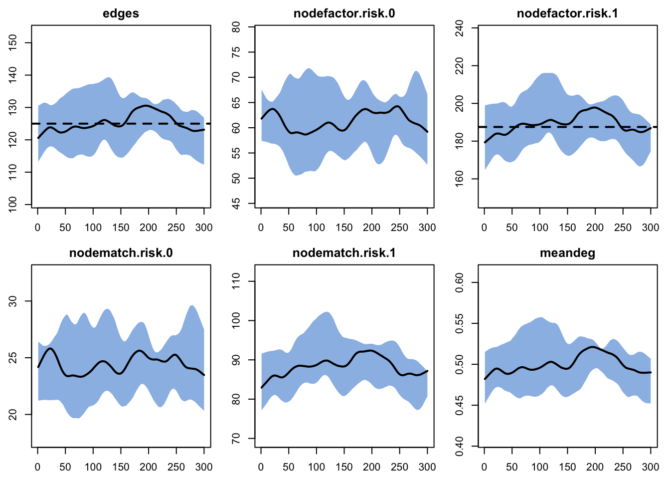
Next, we plot the edges in the post-simulation network diagnostics. Now there is a clear downward trend in the count of edges.
Code
If the population size declined, we might expect the total edge count to decline by the mean degree (meandeg) should remain constant (because we used that network size correction). Alas, the mean degree declined too.
Code
The numerical summary of the statistics in the print of the netsim object reveals that the simulations for edges are a bit lower than the target, and the meandeg is lower than the expected 0.5.
EpiModel Simulation
=======================
Model class: netsim

Simulation Summary
-----------------------
Model type: SI
No. simulations: 20
No. time steps: 300
No. NW groups: 1

Fixed Parameters
---------------------------
inf.prob = 0.1
act.rate = 5
a.rate = 0.001
ds.rate = 0.001
di.rate = 0.001
groups = 1

Model Output
-----------------------
Variables: sim.num s.num s.num.risk0 s.num.risk1 i.num
i.num.risk0 i.num.risk1 num num.risk0 num.risk1 si.flow
ds.flow di.flow a.flow
Networks: sim1 ... sim20
Transmissions: sim1 ... sim20

Formation Statistics
-----------------------
                  Target Sim Mean Pct Diff Sim SE Z Score SD(Sim Means)
edges              125.0  117.790   -5.768  0.886  -8.139         7.172
nodefactor.risk.0     NA   60.456       NA  0.811      NA         4.639
nodefactor.risk.1  187.5  175.123   -6.601  1.629  -7.598        13.553
nodematch.risk.0      NA   24.104       NA  0.369      NA         1.981
nodematch.risk.1      NA   81.437       NA  0.807      NA         6.423
meandeg               NA    0.471       NA  0.003      NA         0.027
                  SD(Statistic)
edges                    11.493
nodefactor.risk.0        10.221
nodefactor.risk.1        20.794
nodematch.risk.0          4.571
nodematch.risk.1         10.191
meandeg                   0.045


Duration and Dissolution Statistics
-----------------------
Not available when:
- `control$tergmLite == TRUE`
- `control$save.network == FALSE`
- `control$save.diss.stats == FALSE`
- dissolution formula is not `~ offset(edges)`
- `keep.diss.stats == FALSE` (if merging)
This example highlights why we add that death rate correction in dissolution_coefs: to increase the persistence of edges from natural dissolution to account for the competing risk of edge dissolution from departure (death).
32.4 Model 3: Varying Population Size
Finally, let’s build a model in which there is a higher rate of disease-specific mortality. Specifically, we will assume here that the mortality rate from disease is twice that of the natural mortality rate (due to all other causes). Therefore, we will parameterize a di.rate = 0.002 and a ds.rate = 0.001. We will not change any other epidemic parameters.
Going back to the network model parameterization, no changes are needed for the formation model target statistics. However, we do need to update the d.rate parameter in dissolution_coefs to account for the higher average mortality in this new model parameterization.
What value of d.rate should we choose, since there are now two death rates in param.net? One natural starting point would be 0.0015, the average of the two rates above. However, what we also need to consider the weighted average of person-time spent in each disease state. If there were equal time spent in S and I, then the simple average would do. But in our model, more total person time is spent in the infected state.
In practice, coming up with a d.rate that works here will involve some trial and error based on analysis of the post-simulation diagnostics. We have selected the d.rate = 0.0018, indicating that more person-time is spent in the I state than the S state.
Code
Dissolution Coefficients
=======================
Dissolution Model: ~offset(edges)
Target Statistics: 40
Crude Coefficient: 3.663562
Mortality/Exit Rate: 0.0018
Adjusted Coefficient: 3.818895
Next, we estimate the network model and simulate the epidemic model again.
First, we review the total population size. Now there is a pretty steep decline in the population size as prevalence increases.
Code
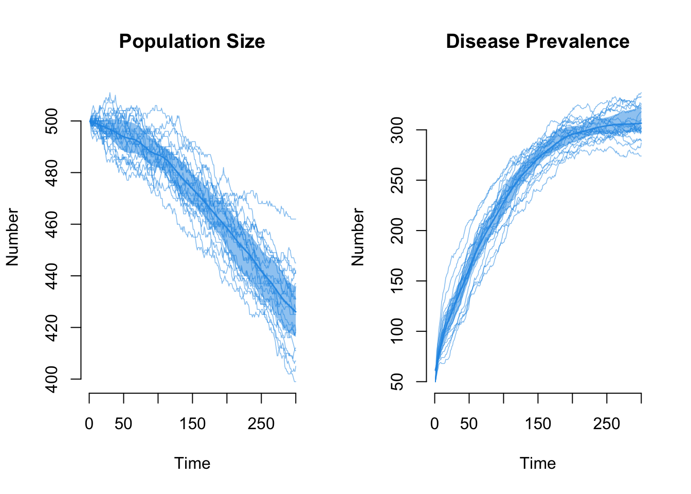
What is the impact on the edges count in the network simulations? It also declines as the population size declines. That is OK! The edges are a function of the mean degree and the population size (N), so as N decreases the edges should decrease.
Code
To account for the declining population size, the mean degree (meandeg) should remain constant if the population size correction and the death correction were implemented correction. And Voila! This is a good model diagnostic.