library(EpiModel)29 Epidemic Models with Demography
This tutorial demonstrates how to model a Susceptible-Infected (SI) epidemic in an open population. An example of an SI epidemic is HIV, with infected persons never leaving the infected stage before mortality. Modeling HIV is quite complicated, and this tutorial is not meant to be a full-scale HIV model per se: it does not include many components of HIV models, such as disease stage, drug therapy, and so on. This only represents SI dynamics generally with the possibility of vital dynamics.
The population is open as we are now including arrivals and departures in the epidemic process. Simulating an epidemic in an open population requires adjustments that accommodate changes to the network structure over time. For the sake of simplicity, the departure processes will not depend on disease status, which will keep the population size stable over time.
This tutorial will include two counterfactual network models that will allow behavior (mean degree and mixing) to vary across two hypothetical risk groups. These behavioral differences might represent different demographic groups (e.g., younger persons and older persons).
Unlike in the tutorial in Chapter 23, we are using an attribute here but not the special group attribute. So we will allow for heterogeneity in network structure but assume equal epidemic parameters. It is relatively straightforward to extend EpiModel to handle both (or a very simple fix here is just to use a nodal attribute group instead of risk below).
Start with loading EpiModel:
29.1 Network Model
The network is initialized as before, but now we set a vertex attribute of risk group onto the network. Risk group will be a binary variable, with the risk groups evenly sized in the population.
nw <- network_initialize(n = 500)
nw <- set_vertex_attribute(nw, attrname = "risk", value = rep(0:1, each = 250))
We will proceed by fitting two network models: Model 1 will feature a scenario in which the mean degree is the same in both risk groups and there is no risk group homophily; Model 2 will feature a scenario in which Risk Group 1 has a higher mean degree and there is strong assortative mixing.
29.1.1 Model 1: Random Mixing, Degree
The first model will assume that there is random mixing in the population, with no preference for same-risk partnerships, and that the two risk groups have the same mean degree. In fact, this means that there is no need to include separate terms for degree and homophily in the network model (it is an edges-only model or Bernoulli random graph).
29.1.1.1 Parameterization
The formation formula for this first model will only include a term for edges. We will use edges to parameterize the overall mean degree in the network.
formation <- ~edgesThe target statistics for each of the terms is as follows. Both Model 1 and Model 2 will use the same mean degree in the population overall: a 0.5 mean degree, which translates into 125 edges in a population of 500 nodes.
target.stats <- 125The dissolution model components will be the same for both models. We specify a homogeneous dissolution model with an average relational duration of 40 weeks. The dissolution coefficients must be adjusted to accommodate the exogenous probability of edge dissolution due to mortality (or other forms of nodal departure). This adjustment has the impact of increasing the coefficient as seen below. Recall that this is because the dissolution model is actually implemented as a persistence model, so a larger coefficient means longer partnerships.
coef.diss <- dissolution_coefs(dissolution = ~offset(edges),
                               duration = 40, d.rate = 0.001)
coef.diss
Dissolution Coefficients
=======================
Dissolution Model: ~offset(edges)
Target Statistics: 40
Crude Coefficient: 3.663562
Mortality/Exit Rate: 0.001
Adjusted Coefficient: 3.7469The d.rate parameter here is the average mortality (or other departure) rate per time step. This will correspond to the epidemic parameters specified below in param.net. In the case that there is disease-induced mortality, this parameter should represent a weighted average of the different departure rates in the full system. It is often challenging to calculate this in advance because disease prevalence and thus disease-induced mortality changes over time. Therefore, research-level models often use some trial and error to specify this parameter.
In this tutorial example a d.rate parameter of 0.001 corresponds to an average “lifespan” (time spent in the population) of 1/0.001 = 1000 timesteps. This is probably unrealistic for most disease models (especially since the average relations last 40 time steps), but we are using a large value for demonstration purposes. In fact, you may encounter the following message if the departure rate is too high relative to the average relational duration. In this test case below, the average “lifespan” is half as long as the average relationship (which probably doesn’t make any sense). We have tried to catch this problem for you with an informative error message. Ok, so let’s use our smaller d.rate parameter of 0.001.
coef.diss.high <- dissolution_coefs(dissolution = ~offset(edges),
duration = 40, d.rate = 0.05)29.1.1.2 Estimation
The network model is estimated using the netest function with all the inputs we specified above.
est1 <- netest(nw, formation, target.stats, coef.diss)29.1.1.3 Diagnostics
For the diagnostics for this model, we set the nwstats.formula to expand the formation formula to specify that we want to monitor the mean degree and mixing by the risk attribute. We do this with nodefactor and nodematch terms, respectively. By adding them to the nwstats.formula, but not in the formation formula for the TERGM itself, we can get summary statistics for simulations to see what the expected values of these terms would be in a null model. Setting levels = NULL in the nodefactor term will output statistics for both risk groups in the model. We can also monitor the nodematch term with a diff = TRUE argument, which allows for differential homophily by group. In this model, there would never be a reason to specify differential homophily by group in the ERGM formula because it would be overspecified (individual diagonal cells are a function of edges and nodefactor terms). It can be used for models either without a nodefactor term, or for models with nodefactor terms but with a mixing attribute with more than two levels. But again we show it here for comparison, and getting you familiar with the different syntax options.
dx1 <- netdx(est1, nsims = 10, nsteps = 1000, ncores = 4,
nwstats.formula = ~edges +
nodefactor("risk", levels = NULL) +
nodematch("risk", diff = TRUE))Printing the diagnostics shows a good fit between the targets and the simulated outputs. There is no difference between the simulated means for nodefactor statistics for risk group 0 compared to risk group 1, indicating no differential in mean degree by risk group.
dx1EpiModel Network Diagnostics
=======================
Diagnostic Method: Dynamic
Simulations: 10
Time Steps per Sim: 1000
Formation Diagnostics
-----------------------
Target Sim Mean Pct Diff Sim SE Z Score SD(Sim Means)
edges 125 123.563 -1.149 0.949 -1.514 2.293
nodefactor.risk.0 NA 124.045 NA 1.217 NA 3.377
nodefactor.risk.1 NA 123.082 NA 1.101 NA 2.823
nodematch.risk.0 NA 31.246 NA 0.488 NA 1.407
nodematch.risk.1 NA 30.765 NA 0.460 NA 1.519
SD(Statistic)
edges 11.258
nodefactor.risk.0 14.180
nodefactor.risk.1 13.454
nodematch.risk.0 5.852
nodematch.risk.1 5.594
Duration Diagnostics
-----------------------
Target Sim Mean Pct Diff Sim SE Z Score SD(Sim Means) SD(Statistic)
edges 40 40.017 0.041 0.271 0.061 0.926 3.424
Dissolution Diagnostics
-----------------------
Target Sim Mean Pct Diff Sim SE Z Score SD(Sim Means) SD(Statistic)
edges 0.025 0.025 0.675 0 1.192 0 0.014Plotting the diagnostics shows that the simulations are right on target for the terms in the formation model. We will skip plotting the dissolution model diagnostics for this example.
plot(dx1)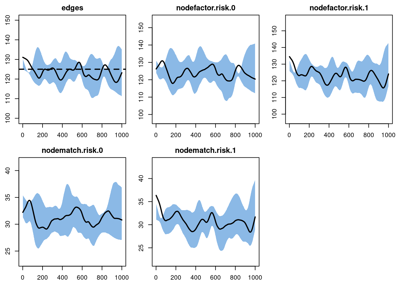
29.1.2 Model 2: Assortative Mixing and Differential Degree
The counterfactual in Model 2 will add differentials in mean degree by risk group and for homophily in risk group mixing by using nodefactor and nodematch terms and associated target statistics.
29.1.2.1 Parameterization
The formula for the formation component of the model will now be as follows. The nodefactor term represents variation in the overall mean degree by the named attribute, risk. The nodematch represents mixing by that named attribute.
formation <- ~edges + nodefactor("risk") + nodematch("risk")As noted, the overall mean degree will remain the same at 0.5 across the two models, but the mean degree by risk group will differ. We will specify that the mean degree for risk group 1 is 0.75. Because the overall mean degree is 0.5, and the proportions of risk groups is equal, that implies that the mean degree for risk group 0 will be 0.25. The target statistic for the nodefactor term is the product of the mean degree of risk group 1 and the size of risk group 1: 0.75 * 250 = 187.5. Finally, we will specify that 90% of the partnerships occur between persons of the same risk group, which equals 112.5 edges.
target.stats <- c(125, 187.5, 112.5)The other components of the model, including the network object and dissolution model components, are recycled from Model 1.
29.1.2.2 Estimation
The new target statistics are entered in this new model with the remaining components from Model 1.
est2 <- netest(nw, formation, target.stats, coef.diss)We can use the summary function to evaluate the coefficient estimates for the nodefactor and nodematch terms, which are strong and highly significant. The specific values of those coefficients do not matter much here (what matters is how they generate simulations of the complete network, below), but the positive sign of both terms shows these are greater than expected than under the null model, precisely as we have parameterized them.
summary(est2)Call:
ergm(formula = formation.nw, constraints = constraints, offset.coef = coef.form,
target.stats = target.stats, eval.loglik = FALSE, control = set.control.ergm,
verbose = verbose)
Monte Carlo Maximum Likelihood Results:
Estimate Std. Error MCMC % z value Pr(>|z|)
edges -9.1603 0.2787 0 -32.871 <1e-04 ***
nodefactor.risk.1 0.6201 0.1123 0 5.522 <1e-04 ***
nodematch.risk 2.0459 0.2860 0 7.153 <1e-04 ***
---
Signif. codes: 0 '***' 0.001 '**' 0.01 '*' 0.05 '.' 0.1 ' ' 1Log-likelihood was not estimated for this fit. To get deviances, AIC, and/or BIC, use ‘*fit* <-logLik(*fit*, add=TRUE)’ to add it to the object or rerun this function with eval.loglik=TRUE.
Dissolution Coefficients
=======================
Dissolution Model: ~offset(edges)
Target Statistics: 40
Crude Coefficient: 3.663562
Mortality/Exit Rate: 0.001
Adjusted Coefficient: 3.746929.1.2.3 Diagnostics
The diagnostics on this second model are run using the same approach as Model 1, but we pass in the fitted model object for Model 2.
dx2 <- netdx(est2, nsims = 10, nsteps = 1000, ncores = 4,
             nwstats.formula = ~edges +
                                nodefactor("risk", levels = NULL) +
                                nodematch("risk", diff = TRUE))
Printing the model shows that the simulated network statistics are consistent with the target statistics in the formation and dissolution model. The simulated mean for the nodefactor target statistic for risk group 0 corresponds to a mean degree of 0.25 (more exactly: 63.2281 / 250 = 0.2529124) in that group, as expected.
dx2EpiModel Network Diagnostics
=======================
Diagnostic Method: Dynamic
Simulations: 10
Time Steps per Sim: 1000
Formation Diagnostics
-----------------------
Target Sim Mean Pct Diff Sim SE Z Score SD(Sim Means)
edges 125.0 125.615 0.492 0.873 0.705 3.381
nodefactor.risk.0 NA 63.228 NA 0.784 NA 2.033
nodefactor.risk.1 187.5 188.002 0.268 1.574 0.319 6.862
nodematch.risk.0 NA 25.313 NA 0.393 NA 0.924
nodematch.risk.1 NA 87.701 NA 0.768 NA 3.493
SD(Statistic)
edges 11.023
nodefactor.risk.0 10.108
nodefactor.risk.1 19.363
nodematch.risk.0 4.832
nodematch.risk.1 9.526
Duration Diagnostics
-----------------------
Target Sim Mean Pct Diff Sim SE Z Score SD(Sim Means) SD(Statistic)
edges 40 39.842 -0.396 0.305 -0.519 1.164 3.663
Dissolution Diagnostics
-----------------------
Target Sim Mean Pct Diff Sim SE Z Score SD(Sim Means) SD(Statistic)
edges 0.025 0.025 0.336 0 0.587 0 0.014The plots look fine here, so we move onto the epidemic simulation.
plot(dx2)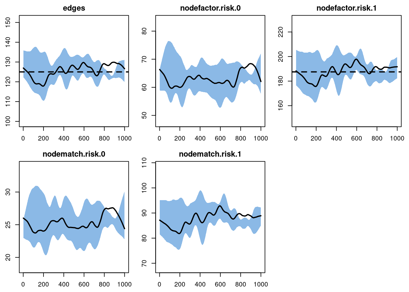
29.2 Epidemic Simulation
This epidemic simulation will investigate how variation in mean degree by risk group and highly assortative risk group mixing jointly impact epidemic prevalence overall and by risk group. We will use one set of epidemic parameters, initial conditions, and control settings shared across the two counterfactual models.
29.2.1 Parameterization
The parameters are entered into the param.net function as in previous tutorial. Since this is an SI epidemic, there will be no recovery rate parameter. The three new parameters will control the arrival rate, departure rate among the susceptibles, and departure rate in the infected group. Note that this is the same rate as what we specified in dissolution_coefs. For this tutorial, we will assume that all three rates are equal, which implies that there is no disease-induced mortality and a stable population size. These can be experimented with in the next lab.
param <- param.net(inf.prob = 0.1, act.rate = 5,
                   a.rate = 0.001, ds.rate = 0.001, di.rate = 0.001)
Similar to the previous tutorial, we only need to specify the number infected at the outset. To generate stable epidemic conditions quickly, we will see that the prevalence is 10%, distributed randomly among the population.
init <- init.net(i.num = 50)The inputs for the control settings share some similarities with the control settings from the Day 3 tutorials, but we will be adding some new parameters here:
resimulate.network: this argument specifies that the network should be resimulated timestep-by-timestep in the model, in response to changing conditions like demography. By default this argument isFALSE, so here we must set it toTRUE.epi.by: this argument provides stratified prevalence estimates by a categorical attribute in the network (if we had used the specialgroupattribute, stratified estimates would be available by group by default). By default, this argument isNULL.tergmLite: this is a streamlined approach for network simulation that speeds up the process by 20-50 fold. This is possible because of trade offs between complete versus sparse representation of the underlying network object. By default this is set toFALSE, which means that the full network object is retained. With tergmLite methods, this means that the full network object cannot be plotted at different time points (because the individual-level network history is not retained). Otherwise, the two methods should be equivalent.
29.2.2 tergmLite Comparison
For the sake of comparing simulation efficiency with and without tergmLite, let’s run a single simulation of Model 1 with each method. All that needs to be changed is the tergmLite parameter.
control.full <- control.net(type = "SI", nsteps = 300, nsims = 1, ncores = 1,
                            resimulate.network = TRUE, epi.by = "risk", tergmLite = FALSE)
control.tl <- control.net(type = "SI", nsteps = 300, nsims = 1, ncores = 1,
                          resimulate.network = TRUE, epi.by = "risk", tergmLite = TRUE)
Next, we will run a single simulation here live, so you can compare the speed difference.
sim1.full <- netsim(est1, param, init, control.full)
sim1.tl <- netsim(est1, param, init, control.tl)
And with the difference in speed comes the trade off with the data calculated and stored. In the full (non-tergmLite) version, we retain the contact network data:
sim1.fullEpiModel Simulation
=======================
Model class: netsim
Simulation Summary
-----------------------
Model type: SI
No. simulations: 1
No. time steps: 300
No. NW groups: 1
Fixed Parameters
---------------------------
inf.prob = 0.1
act.rate = 5
a.rate = 0.001
ds.rate = 0.001
di.rate = 0.001
groups = 1
Model Output
-----------------------
Variables: s.num s.num.risk0 s.num.risk1 i.num i.num.risk0
i.num.risk1 num num.risk0 num.risk1 si.flow ds.flow di.flow
a.flow
Networks: sim1
Transmissions: sim1
Formation Statistics
-----------------------
Target Sim Mean Pct Diff Sim SE Z Score SD(Sim Means) SD(Statistic)
edges 125 126.247 0.997 5.855 0.213 NA 11.525
Duration Statistics
-----------------------
Target Sim Mean Pct Diff Sim SE Z Score SD(Sim Means) SD(Statistic)
edges 40 40.286 0.714 1.073 0.266 NA 2.75
Dissolution Statistics
-----------------------
Target Sim Mean Pct Diff Sim SE Z Score SD(Sim Means) SD(Statistic)
edges 0.025 0.024 -2.27 0.001 -0.734 NA 0.013And in the tergmLite version, we do not. We still have access to all the data except for the network history, which is typically not needed for full-scale research models anyway.
sim1.tlEpiModel Simulation
=======================
Model class: netsim
Simulation Summary
-----------------------
Model type: SI
No. simulations: 1
No. time steps: 300
No. NW groups: 1
Fixed Parameters
---------------------------
inf.prob = 0.1
act.rate = 5
a.rate = 0.001
ds.rate = 0.001
di.rate = 0.001
groups = 1
Model Output
-----------------------
Variables: s.num s.num.risk0 s.num.risk1 i.num i.num.risk0
i.num.risk1 num num.risk0 num.risk1 si.flow ds.flow di.flow
a.flow
Transmissions: sim1
Formation Statistics
-----------------------
Target Sim Mean Pct Diff Sim SE Z Score SD(Sim Means) SD(Statistic)
edges 125 124.987 -0.011 2.737 -0.005 NA 8.3
Duration and Dissolution Statistics
-----------------------
Not available when:
- `control$tergmLite == TRUE`
- `control$save.network == FALSE`
- `control$save.diss.stats == FALSE`
- dissolution formula is not `~ offset(edges)`
- `keep.diss.stats == FALSE` (if merging)29.2.3 Main Epidemic Simulation
For the main epidemic model comparison, we are going to run 5 simulations on 5 cores with tergmLite = TRUE. Each model run takes about in about 45 seconds on my laptop.
control <- control.net(type = "SI", nsteps = 300, nsims = 5, ncores = 5,
                       resimulate.network = TRUE, epi.by = "risk", tergmLite = TRUE)
To simulate the two network models, we use two calls to the netsim function, one with the fitted estimation object from Model 1 and the other from Model 2. When run in interactive mode, basic output from the model progress will be printed to the console, with information on current prevalence, population size, and flows.
sim1 <- netsim(est1, param, init, control)
sim2 <- netsim(est2, param, init, control)
Printing the netsim output object shows its contents. The output compartments now include both the overall susceptible and infected numbers but also the numbers stratified by values of the risk group variable.
sim1EpiModel Simulation
=======================
Model class: netsim
Simulation Summary
-----------------------
Model type: SI
No. simulations: 5
No. time steps: 300
No. NW groups: 1
Fixed Parameters
---------------------------
inf.prob = 0.1
act.rate = 5
a.rate = 0.001
ds.rate = 0.001
di.rate = 0.001
groups = 1
Model Output
-----------------------
Variables: s.num s.num.risk0 s.num.risk1 i.num i.num.risk0
i.num.risk1 num num.risk0 num.risk1 si.flow ds.flow di.flow
a.flow
Transmissions: sim1 ... sim5
Formation Statistics
-----------------------
Target Sim Mean Pct Diff Sim SE Z Score SD(Sim Means) SD(Statistic)
edges 125 122.241 -2.207 2.239 -1.232 6.119 11.656
Duration and Dissolution Statistics
-----------------------
Not available when:
- `control$tergmLite == TRUE`
- `control$save.network == FALSE`
- `control$save.diss.stats == FALSE`
- dissolution formula is not `~ offset(edges)`
- `keep.diss.stats == FALSE` (if merging)29.2.4 Model Analysis
Our model analysis will consist of model diagnostics, and then the examination of the epidemiological outcomes overall and by risk group.
29.2.4.1 Post-Simulation Diagnostics
It is important to first examine the network model diagnostics after the epidemic simulation, since the vital dynamics within these simulations may have changed the structure of the network in unexpected ways. Here we show how to plot model diagnostics recorded within the epidemic simulation. Although we have saved all the network statistics in the formation formula, here we plot the number of edges over time.
par(mfrow = c(1, 2))
plot(sim1, type = "formation", stats = "edges", ylim = c(0, 250), qnts = 1)
plot(sim2, type = "formation", stats = "edges", ylim = c(0, 250), qnts = 1)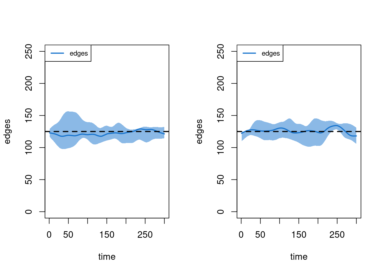
29.2.4.2 Epidemiologic Outcomes
This example shows how to plot outputs of two separate simulation objects onto one plot window using the add argument. Note that this requires manual specification of the plot legend. Our substantive result from this model comparison is that the total prevalence in the population is about the same (not exactly, but pretty close!).
par(mfrow = c(1, 1))
plot(sim1, y = "i.num", qnts = 1, main = "Total Prevalence", mean.col = 3, qnts.col = 3)
plot(sim2, y = "i.num", qnts = 1, mean.col = 6, qnts.col = 6, add = TRUE)
legend("topleft", c("Model 1", "Model 2"), lwd = 3, col = c(3, 6), bty = "n")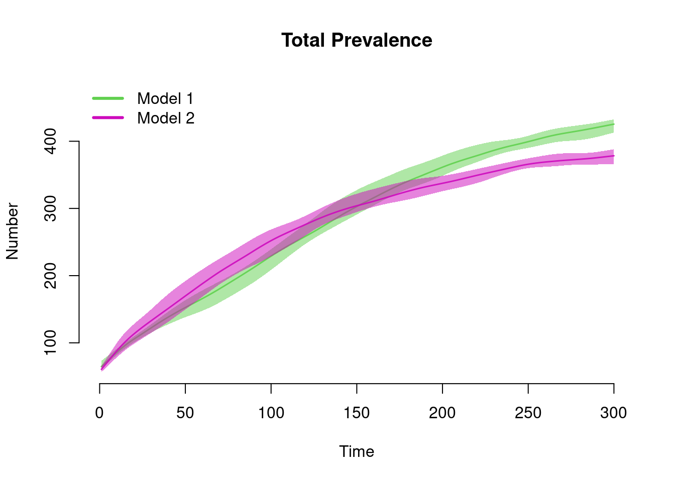
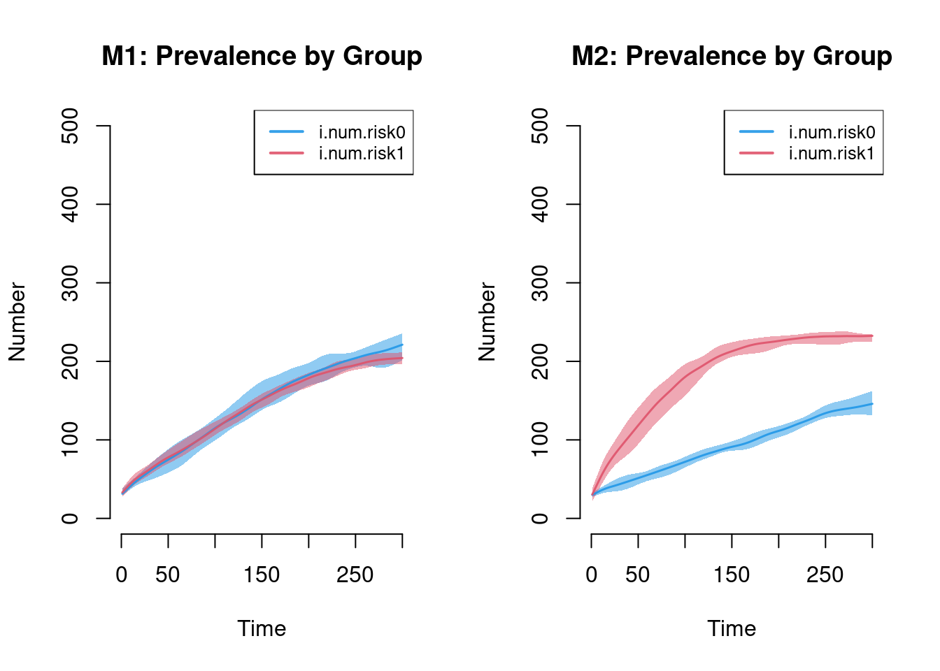
The next plot shows the prevalence by risk group in Model 1 compared to Model 2. Setting the ylim manually is necessary to ensure that the axes on both plots match. The substantive result is that Model 1 shows no differences in prevalence by risk group (as expected) and Model 2 shows large differences.
par(mfrow = c(1, 2))
plot(sim1, y = c("i.num.risk0", "i.num.risk1"),  legend = TRUE, qnts = 1,
     ylim = c(0, 500), main = "M1: Prevalence by Group")
plot(sim2, y = c("i.num.risk0", "i.num.risk1"), legend = TRUE,  qnts = 1,
     ylim = c(0, 500), main = "M2: Prevalence by Group")